


Over the last decade, many companies debuted data visualization platforms that enable organizations to analyze trends and understand their businesses better. Tools such as Microsoft Power BI, Tableau, Amazon QuickSight, and QlikView represent just a few of the many potential applications businesses could leverage.
Given that CODE Magazine focuses on computer programming, many of us easily fixate ourselves on the potential capabilities for creating queries, developing custom programming code, or creating extensive calculations on the back-end behind the scenes. However, the majority of business users use these data visualization platforms to dynamically interact with this top layer of application: the dashboard. To develop these user-friendly dashboards, we need to think more like designers instead of programmers.
The Importance of Dashboard Design
The best-designed and implemented dashboards appear effortless; we like them more, but yet can't quite explain exactly why. Their likeability comes not by accident, but by mindfully following design principles implemented with the end viewer in mind. Good design isn't an accidental result, but rather a strategic decision to choose to make the small design choices that have a huge impact on the end result.
Nudging
In order to maximize the likelihood that users make your dashboard part of their everyday processes, you need to design dashboards that guide users through not only key visuals and figures, but also how they collectively interact with each other. A dashboard can check all of the user's requirements, yet still not yield much value to the user because there's a dissonance between what they tell you they would like and how their actual behavior responds to the dashboard. How do you bridge this gap? Let's put this discussion in the context of the nudging proposition.
Nudging is defined as tiny prompts that alter our behavior - specifically social behavior. Richard Thaler extensively examined nudge theory in his book Nudge. Examples of nudging techniques include:
- Encouraging recycling, by placing a larger recycling bin in a more prominent location than a smaller garbage bin in many cities and businesses.
- Sending out electricity bills that compare usage to that of neighboring housing units to encourage users to limit their electricity usage.
- Charging even the nominal amount of a few cents for single-use plastic bags encourages people to bring their own reusable bags when shopping or not use one at all.
Much like Ikea furniture comes in a box with pre-cut pieces and instructions for assembly, you want to present your dashboards to the user in a similar manner. Think of the instruction manual as the nudging component to the product. This translates to techniques in designing data visualizations (which I'll discuss later) such as:
- Choosing visuals to convey strategic points
- Positioning and the number of charts/visuals
- Instruction prompts
- Colors to point out key trends
Users want you to do the analysis of the components beforehand, but they want to interact with the data themselves using the instructions you provide. If the pieces don't fit together, or if the instructions don't make sense, building a successful final product becomes much more difficult.
The Starting Dashboard
I chose Tableau for this example because I think it enables a focus on making changes with best design practices in mind, given that the tool focuses on the visuals themselves. It also works on Apple products at the time of publication for this article, and Microsoft Power BI, unfortunately, does not. You can use different versions of Tableau, but for the purposes of this article, I'll use Tableau Public Desktop, which is free to download. You can download the starting file from Tableau Public Online to follow along with the changes I make in this article, and then save it by uploading it to your own Tableau Public Online account.
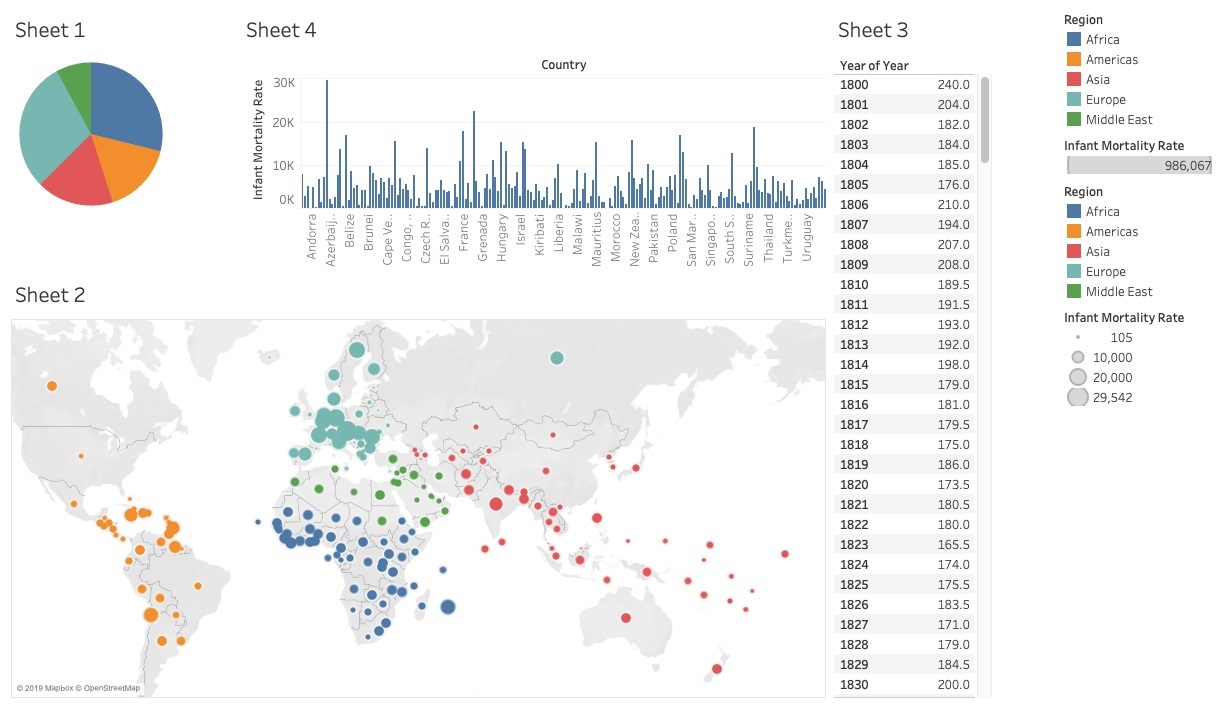
I obtained the infant mortality data from the impressive data section of the Gapminder website developed by the late Hans Rosling. The data set contains the infant mortality rates by country and by year from 1800 until 2015. Note that there are incomplete data sets because some countries may not have data (or at least useable data) for all of these years. I categorized each country into its own region of the world, as you can see in the region mapping key file in Figure 1.
The Gapminder site defines infant mortality as the number of deaths in the first two years of life for every 1000 live births. Although you may think this project is taking a morbid direction, you'll see that the Tableau dashboard helps communicate a much more positive outcome. A decrease in these rates means that the survival rates are increasing and improving global health outcomes.
To walk through the steps of applying best visualization design practices, let's begin with a less-than-optimal Tableau dashboard I created, as seen in Figure 1. I can make strategic design and formatting changes that transform it into a more effective dashboard built with the end user in mind.
You will need several components to try this out on your own, including the Tableau Public dashboard links below and the link for the two Excel files and the PNG image that are available on the CODE Magazine page associated with this article:
- Starting Tableau dashboard : https://public.tableau.com/views/VisualizationBestPracticesstartingfile/Dashboard1?:embed=y&:display_count=yes&:origin=viz_share_link
- The Excel file from Gapminder data with the infant mortality rates
- The Excel file for country to region mapping
- The Gapminder logo
- Ending Tableau dashboard: https://public.tableau.com/shared/8TZ3K2TWW?:display_count=yes&:origin=viz_share_link
You need to update the Tableau file to point to the Excel file on your own dashboard:
- Download the Tableau Desktop Public application (free version) or you can use Tableau Desktop if you already use that
- Download both Excel files and the Gapminder logo to a folder in your own desktop or documents folder.
- Open up the Tableau link for the starting dashboard with your own Tableau application
- Go into the Data Source tab of the Tableau file, click on each of the connections for the rates and region key, and set the folder connection to the path on your own desktop.
After you update the sources, the rest of the visualization will update as well, and you can begin the transformation process.
The “Ikea Effect”
Looking at Figure 1, can you tell at first glance what the initial dashboard is analyzing? Inconspicuous legends and axis labels serve as the only indications that you're studying infant mortality rates. The user shouldn't have to guess at what you're trying to do.
Building successful data visualizations involves striking a balance between giving dynamic options to the viewer and your own design and analysis process. When viewers feel like they do most of the work by interacting with the dashboard and they enjoy the process, you're telling them that you value their ability to analyze the data trends and take ownership in this process. Psychologists define this as the “Ikea effect” (https://www.bbc.com/worklife/article/20190422-how-the-ikea-effect-subtly-influences-how-you-spend) where the customers (in this case dashboard viewers or users) feel they achieve the greatest value for their investment. This is the Holy Grail for many businesses.
On the flip side, you need to do a lot of work on your end to get the users to feel this empowerment and ownership in the process. Making the process easy for the user involves putting yourself into their thought patterns to analyze the unknowns and numbers before they even see them in the dashboard. These areas for you to analyze beforehand for them include:
- The meaning and magnitude of data set numbers
- The relationship between data points and data fields
- Optimal ways to see the data in visuals and charts
How do you want to measure the infant mortality rate? Does a higher rate indicate a better or worse metric? You need to establish that you want to see lower infant mortality numbers because this means that more babies are surviving out of infancy, which also indicates improving public health outcomes. You can't assume that the reader already knows this, and you need to explicitly say what the numbers mean in context of the bigger picture.
Furthermore, you also need to indicate how you're aggregating these infant mortality numbers. Each point in the data source represents the infant mortality for a given year and country. If you wanted to determine the global infant mortality rate for 1990, for example, you need to analyze the data points for all of the countries that year. It doesn't make any sense to sum them together because they represent rates and not absolute values. It makes more sense to average all of these data points to get this global mortality rate the years and countries we want to see as an aggregated number.
If you buy furniture from Ikea, you assemble it yourself from pre-cut pieces that come in a box that designers planned out and tested ahead of time. Similarly, in dashboards, you want to analyze the data and plan out the dashboards before passing it off to the user to interact with in a pre-packaged box in the form of a dashboard. If you don't include a necessary piece or if the sizing doesn't work, neither you nor the viewer get the desired finished product or result. Much like Ikea furniture comes in a box with pre-cut pieces and instructions for assembly, you want to present your dashboards to the user in a similar manner. Users want you to do the analysis of the components beforehand, but they want to interact with the data themselves using the instructions you provide. If the pieces don't fit together or if the instructions don't make sense, the likelihood that they will embrace this dashboard as their own goes down substantially.
Good Design Isn't an Accident
How do you approach designing your best possible version of the dashboard? What do you consider for the job at hand? You want to analyze the data initially to create components for the dashboard that fit together with each other. Much like an Ikea furniture pack, you design and test the pieces to make sure they fit together beforehand.
When you like the way something looks, you can't always quite explain why. The “why” comes through your decision to strategically choose to apply design principles to it. Designing an effective dashboard that users embrace interacting with is not an accident, but rather a well-planned approach that keeps the user in mind.
Choose the Right Visuals for the Job at Hand
The first step in this process is selecting visuals that represent the data correctly, and also effectively communicate the results and trends in the data. There's no one chart that works for all data and no one data set that works for all charts. I encourage you to experiment with charts within the data visualization application to compare how they represent the data and what visual works best for your intended result.
Effective chart options include:
- Bar charts
- Line charts
- Scatter plots
- Box and whisker plots
- KPI metrics
- Heat maps
- Highlight tables
You can see the infant mortality rates by region represented as a pie chart in the upper left-hand corner of Figure 1. This chart presents two big issues when you view it:
- You can't easily distinguish between the slices of the pie because you have to guess the angles rather than actually measuring the numbers.
- The chart represents the infant mortality rate as a sum of the rates, which can mislead the audience because regions with more data points and complete data will have a bigger slice, even if they have lower infant mortality rates.
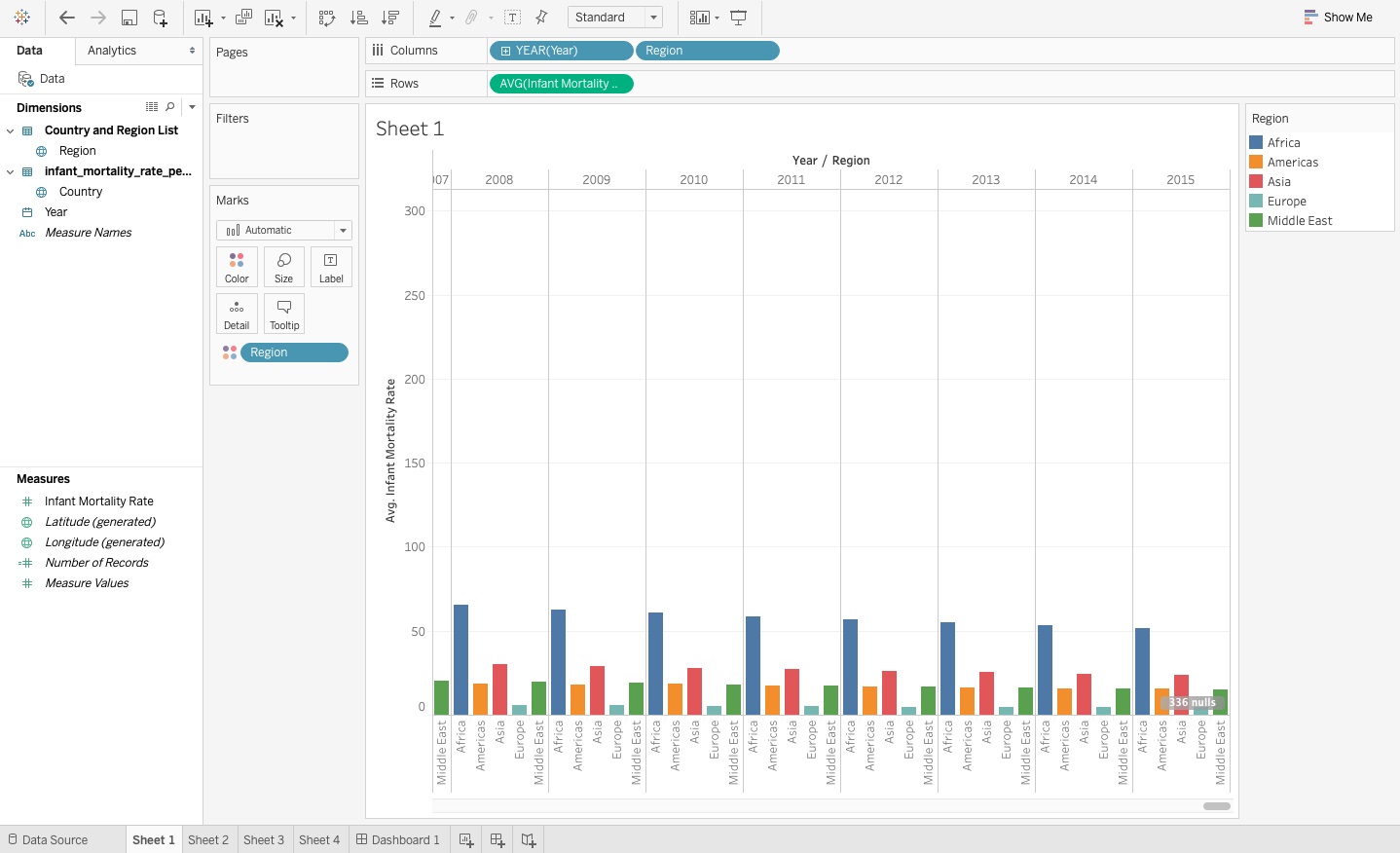
The bar chart (Figure 2) does a much more effective job of showing the average infant mortality rate by region (changed from the sum aggregation in the pie chart), and you can easily rank and compare these rates between regions directly within the chart.
To change a pie chart into a horizontal bar chart:
- Move the “Region” dimension to rows.
- Change the chart from a pie chart to a horizontal bar chart in the Show Me options menu.
- Change the aggregation of the infant mortality rate from Sum to Average.
You also lose the time dimension this way because you're measuring the average infant mortality rate for all years for countries within each region in Figure 2 rather than in a certain year.
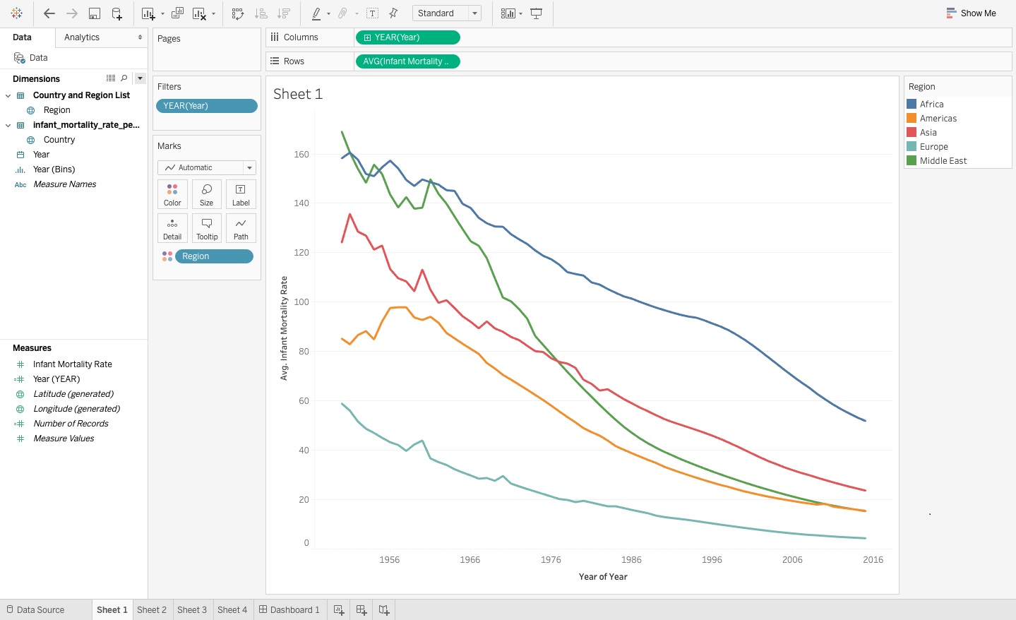
Because you want to measure a time value, you can use a line graph or a bar graph. What if you took this infant mortality data by region and put the trends in a bar chart using a time dimension x-axis? You can see the results of this visual in Figure 3, where each region is distinguished within each year on the x-axis with a color as well as a label.
This chart option still poses some issues, including:
- Because you now have both the region and time on the x-axis, the axis becomes very long and difficult to read. Even adjusting the fit, you still need to process a lot of data points.
- If you compare the trends by year for a certain region (say Europe), how can you quickly tell if the infant mortality rate improves from the previous year?
To change from a horizontal bar chart (Figure 2) to a vertical bar chart (Figure 3) with time on the x-axis:
- Move the Regions dimension to columns and the average Infant Mortality aggregation field to rows, and you now see the chart automatically update.
- Add Years to the columns in front of the Regions, and you now see a bar chart with a very long x-axis.
- Take the Regions dimension from the fields and place it on the Color Marks card, and you now see regions in two places of the chart: one for the x-axis and one for the color.
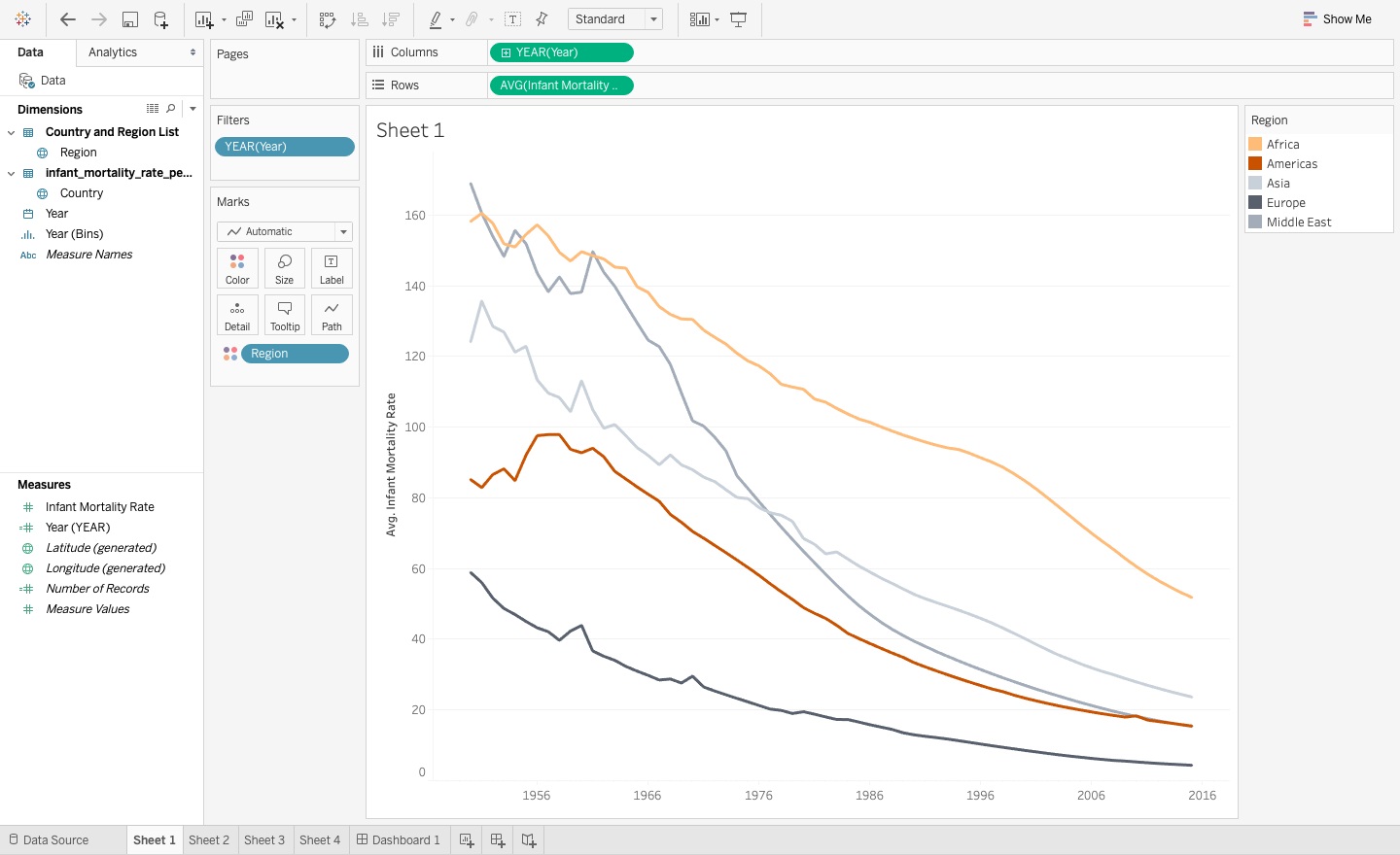
You can't stack up the region bars in Figure 3 because you want to average rather than sum the rates. Showing the average infant mortality rates by region as a line chart mitigates the size and readability issues that you encounter for this scenario with bar charts.
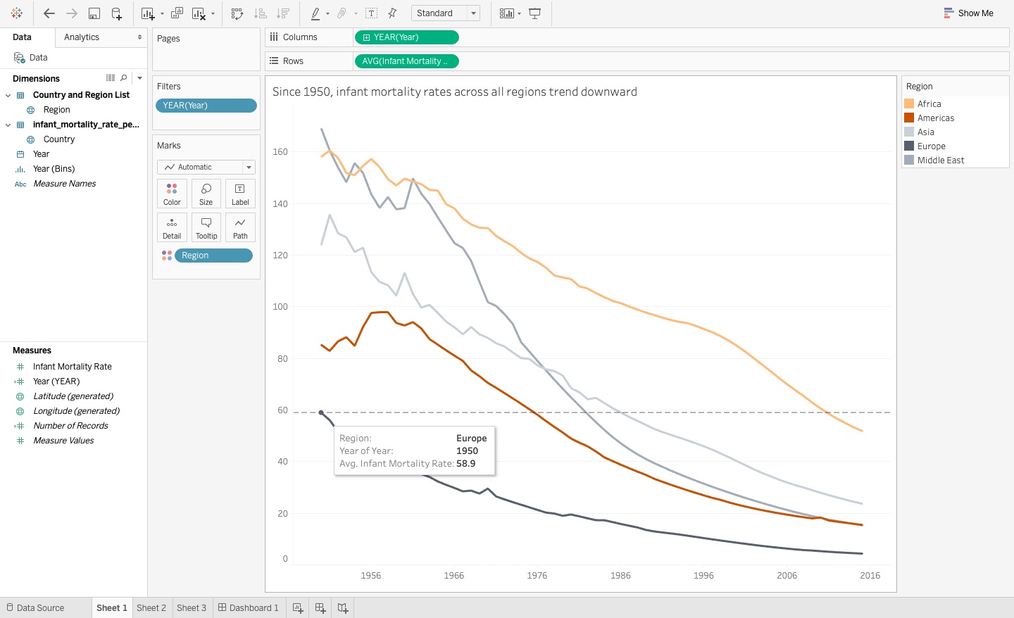
The line chart in Figure 4 allows you to easily rank the regions for each year, and you can see the infant mortality rate trends by region because each point in the graph joins to the point for the next year and the previous year and so on. More importantly, you can also easily see that the rates trend downward across all regions, which means that global health outlooks are improving, even if you continue to see disparity among the regions.
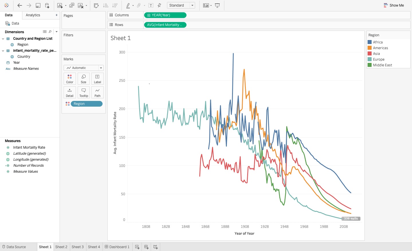
To convert from a vertical bar chart into a line chart: In the Show Me options menu, select the line chart. You can see the updated chart in Figure 4.
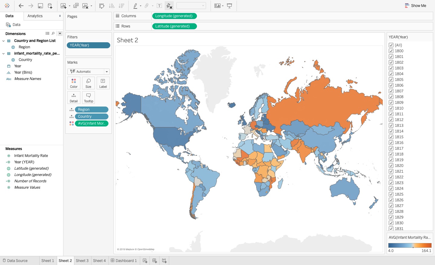
The world map you saw in Figure 1 represents the infant mortality rate by country, with the color representing the region, and the size of the bubble representing the sum of the infant mortality rate for that country across all years. Notice that the map shows the bubble size as the sum of the infant mortality rates, which misleads the viewer, so you'll need to update the aggregation to average across all years for each country. You may also find it difficult to distinguish between the sizes of the bubbles or to determine trends or discrepancies within a region because the bubble sizes are small to start with on the dashboard.
I changed the map type to the filled map you see in Figure 5, where the darker colors represent higher infant mortality rates over a two-hundred-year range, and the lighter colors represent lower infant mortality rates. You can also see higher rates concentrated among neighboring countries in sub-Saharan Africa. Notice that the visual automatically dropped the region dimension completely from the map visual. The filled map makes it easier to compare rates between neighboring countries because you can see color differences much more easily than bubble-sized differences.
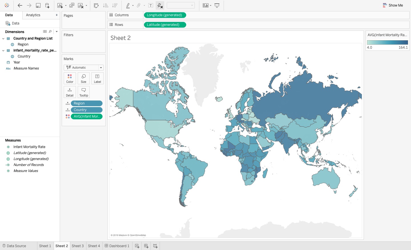
To change from a bubble chart (Figure 1) into a shaded filled chart (Figure 5):
- Select the Show Me option menu and pick the maps chart icon.
- Change the aggregation from Sum to Average for the Color Marks card option.
Now I'm going to tackle the two charts you saw in Figure 1 that show the infant mortality rates by country as a bar chart and the average infant mortality rate by year as a data table by combining them into a single visual rather than two, which makes it easier to easier. You can see some key pieces of information in both graphs, such as easily identifying the countries with lower infant mortality rates and also that the infant mortality rates go down substantially over the last fifty years.
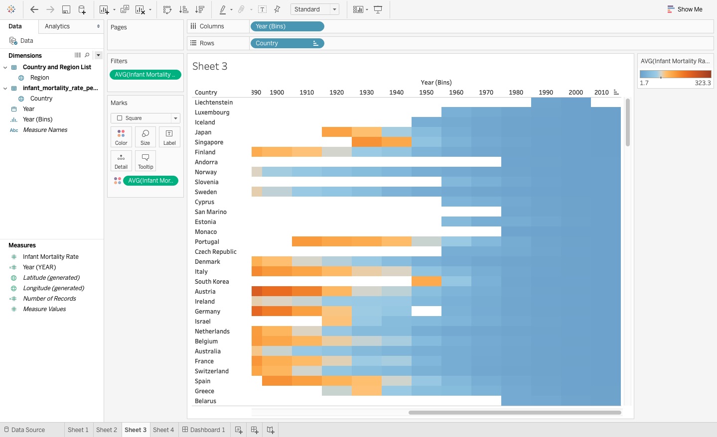
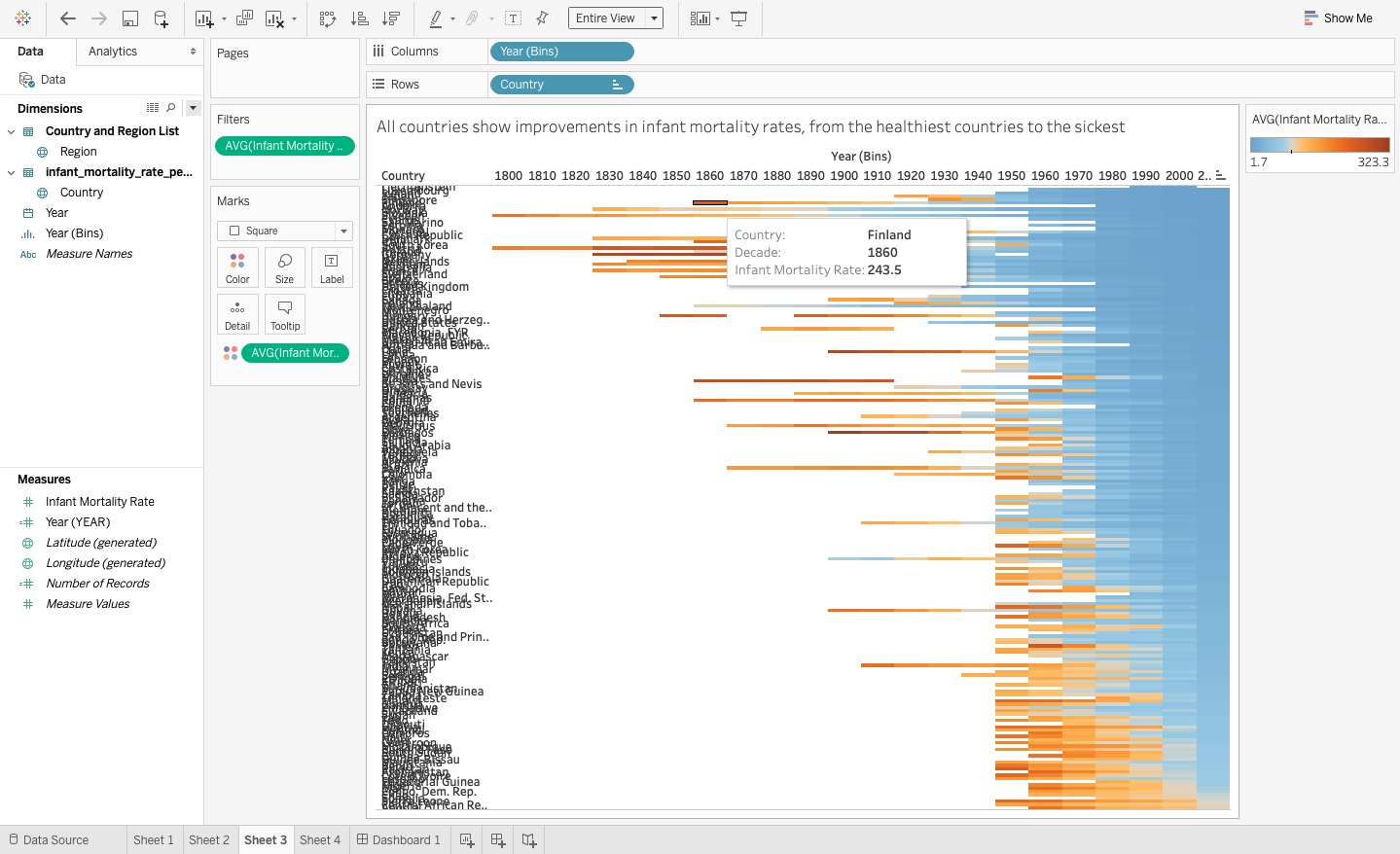
Figure 6 shows a data table summarizing the infant mortality rate with the countries on the row labels, the years in the column labels, and the corresponding values effectively as cell coordinates in the middle. If you looked around the Gapminder Excel file storing this data, you might notice that it looks like the original data set with the countries listed alphabetically in the rows and the years listed chronologically as columns at the top. Because there's only a single rate for each of these coordinates, it doesn't technically matter whether you select sum or average as the aggregation.
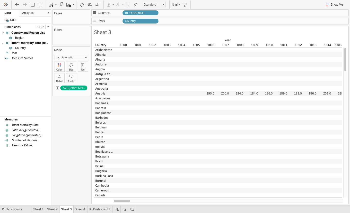
You also need to ask yourself if you think that the table visual in Figure 6 serves as the most effective way to easily view and analyze the data. Although you may find it nice to more easily see with numeric values how the rates are improving for each country over a two-hundred-year time frame, looking at a lot of numbers without visual cues or assistance can get fatiguing.
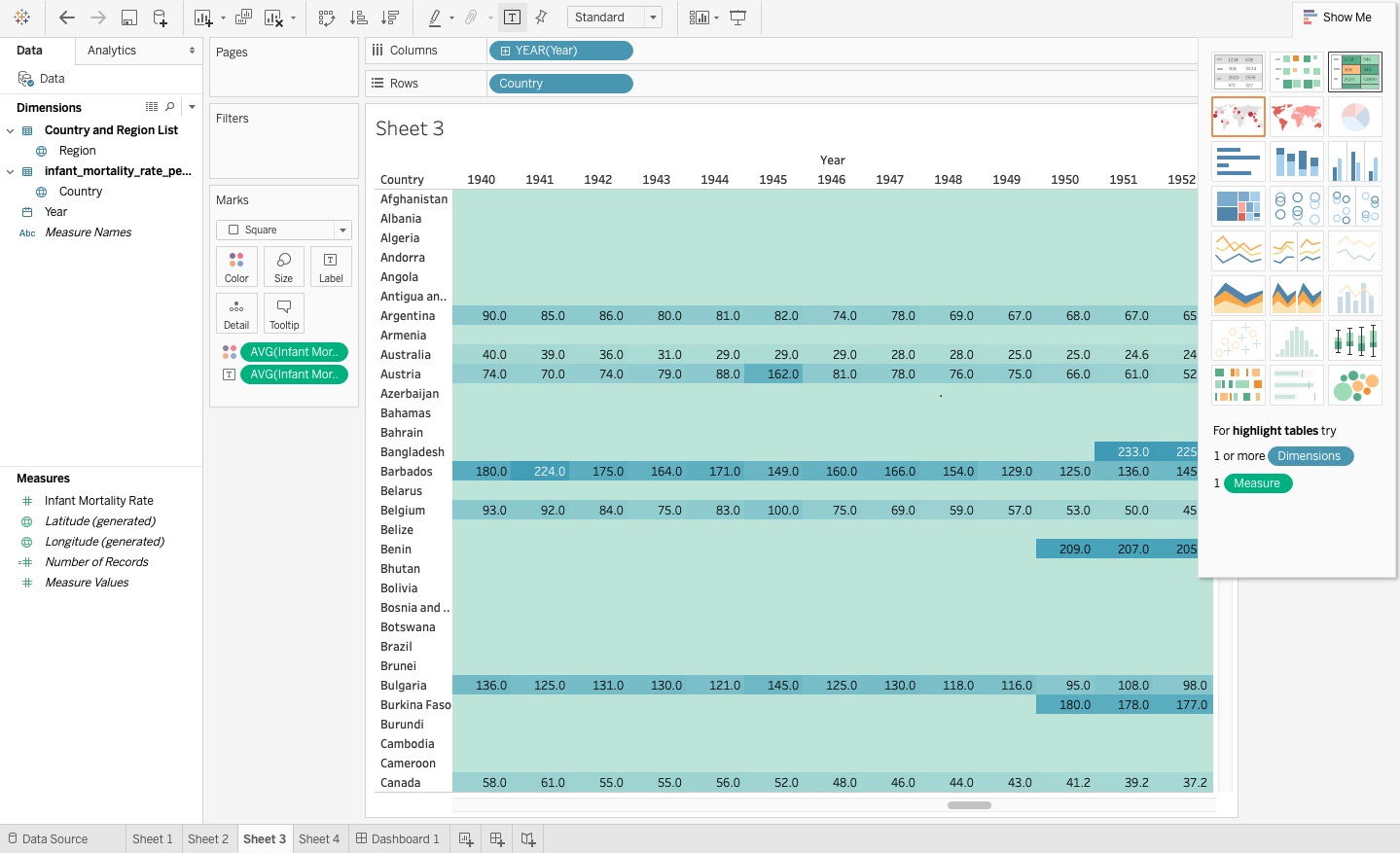
You can still use the idea of a table but instead, what if you use a highlight table instead, as you see in Figure 7? This visual shows both the rate as a text value and a color, and you can see that the color effectively illustrates an improved infant survival rate in recent years for all countries in this view.
Now change it into a single table (Figure 6) with rows and columns combined with the data in the chart, and then into a highlight table (Figure 7):
- Move the Year dimension from rows to columns.
- Add the Country dimension to the rows, so that you now have a data table with years in the column labels and countries in the row labels.
- In the values area (or the Text Marks card), you have an average of infant mortality rate. It doesn't matter if you use sum or average here because for each row and column coordinate in the data table, you only have a single corresponding value, but it makes the most sense to just select the average aggregation to line up with the other visuals. If you inspected the Excel file, you may remember this is what the data table looks like.
- To convert to a highlight table, select the highlight table icon from the Show Me menu. If it switches the rows and columns when you convert the visual type, just move them back into the correct positions.
Notice that the empty values show colors, which you don't want to see. You're not done with this visual yet, and it won't look like this after you finish making modifications to it.
Use Bins to Simplify Visuals
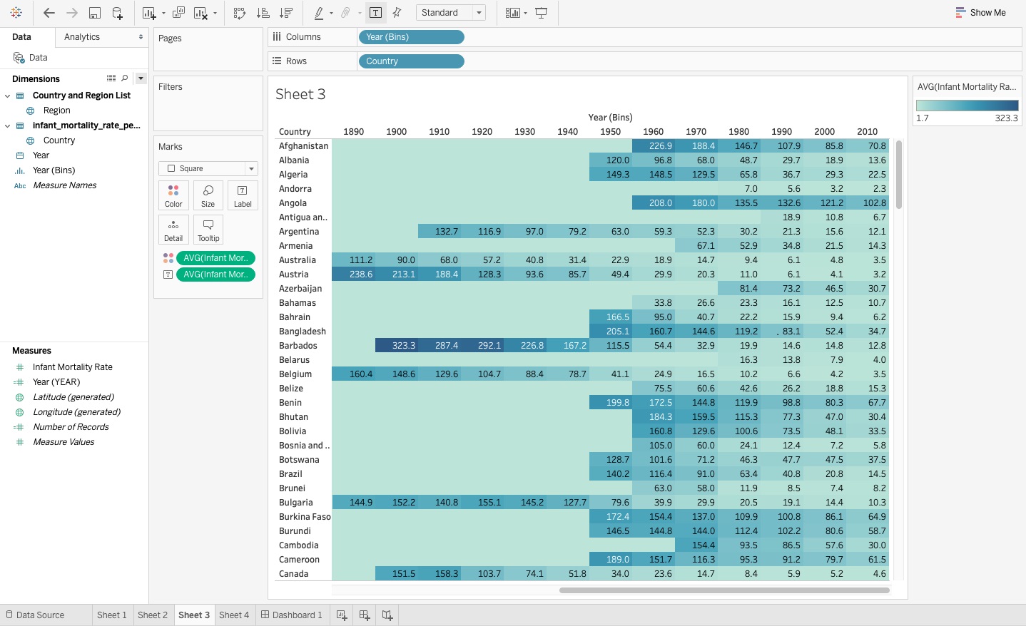
Notice in the data table you just created in Figure 9 that because you're measuring rates over more than two hundred years, you can't see all the years without having to use the scroll bar. You also already know that you don't have consistent data back to historical periods farther in the past and even across contiguous time spans. Averaging the infant mortality rate across ten-year time segments rather than a single year using bins in Tableau creates some noted advantages:
- If a country has gaps in a time range, averaging out the rates within a ten-year segment allows you to smooth out those inconsistencies.
- It also makes it possible to see the entire time range in a single view, as you can see in Figure 8. I chose to use ten years because it allows me to have enough aggregated rates within a reasonable time range without missing too many data points.
To create bins for the years and update the highlight table (Figure 8):
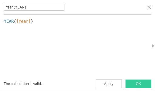
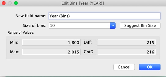
- Add a newly calculated field for the year and enter the formula Year (YEAR) = YEAR([Year]) (see Figure 9).
- Convert this new field from a measure to a dimension by right-clicking on the new measure and selecting Convert to Dimension.
- Now, right-click on this new dimension Year (YEAR), select Create > Bins, and a new dialog box will open up.
- Use 10 (as in ten years) for the size of the bin and keep the name as Year (Bins).
- You can now see a little histogram icon next to the field name in the dimensions list (see Figure 10).
- Now add the new year bin to the data table next to the Year dimension in the column shelf, and remove the Year dimension because you no longer need it.
Sort the Labels
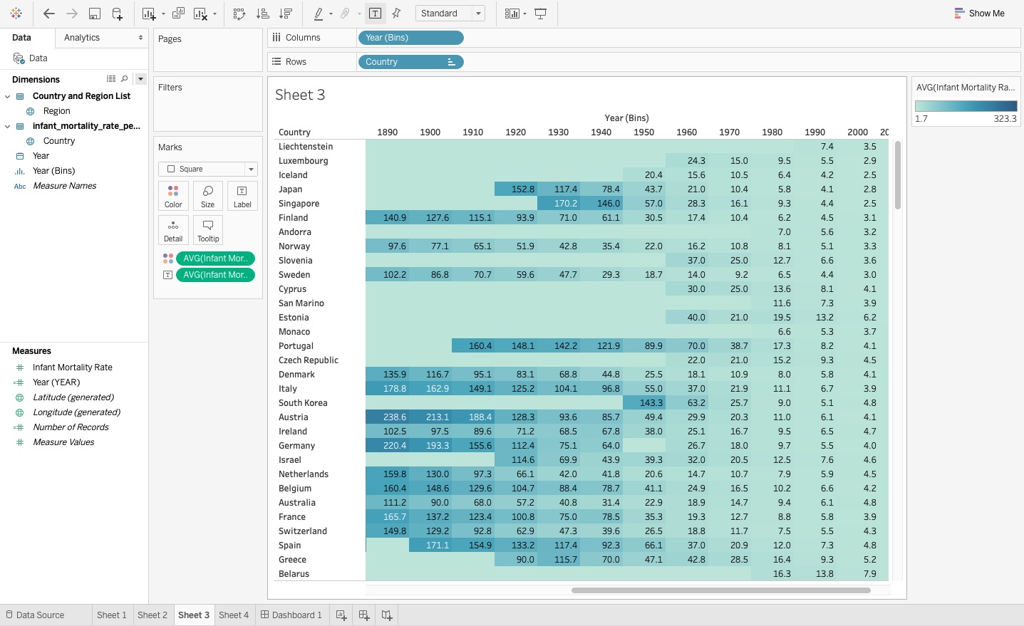
The highlight table you created (shown in Figure 10) shows the trends by country, where you determine the order of the countries in the labels simply by their alphabetical order. You might find this a helpful set up if you want to easily find Belgium in the list for example, but you can't identify the country with the lowest rates without having to navigate through the list. I think it makes the most sense to put the country with the best outcome since 2010 at the top and rank the rest of the countries as they fall into the subsequent order for infant mortality rates, as you see in Figure 11.
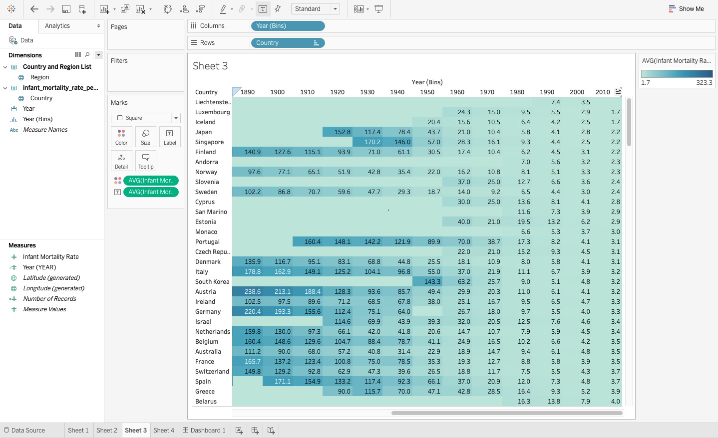
To sort the country order:
- Go to the last column where the 2010 through 2015 years aggregate and click on the header. You'll see the sorting icon that looks like a little bar chart appear.
- Click on the little horizontal bar chart icon once, where you see the highest rate for Angola, then click on it again to see it listed by lowest infant mortality rate.
Make the Labels Easy to Read
If you cut off the label names in a visual, do you expect the viewer to fill in the missing letters and guess the name? In Figure 11, you can't see the entire country name for the healthiest country. Even if you know to add an “in” to complete “Liechtenstein,” that may not be an option if you have more than two hundred or so options (country names) to guess the finished name outcome, which Figure 12 will spare you the pain of having to do.
To expand the size of the country column:
- Hover over the border between the country name and the values section until a double arrow appears.
- Drag the arrow until the column width expands to comfortably fit the country names in the immediate view, as you see in Figure 12.
You can also wrap the text fields, but I wouldn't recommend that approach for the highlight table because it increases the height of these wrapped fields and throws off the sizing for the entire visual, and can make it more difficult to read.
Use Filters Within Visuals
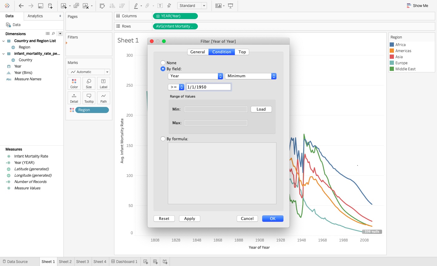
The line chart you created in Figure 4 looks like colored spaghetti lines over a two-hundred-year time frame, which can make it slightly difficult to analyze. Because incomplete data drives much of this fluctuation, if you want to use this line chart visual as an effective analysis tool, it seems sensible to filter down the chart to only show the trends from 1950 and onward, as you see in Figure 13.
To adjust the line chart:
- Go to Sheet 1 and add Years to the Filters Marks card.
- Select Years and the condition as greater than or equal to the 1st of January in 1950, as you see in Figure 14.
- Filter out the null region from the table (remember these are countries that you don't have a matching region for because they are so small) by dragging the Region dimension to the Filter card.
- Also filter out nulls by excluding them from the data by clicking on the null values at the bottom of the chart and selecting Filter data.
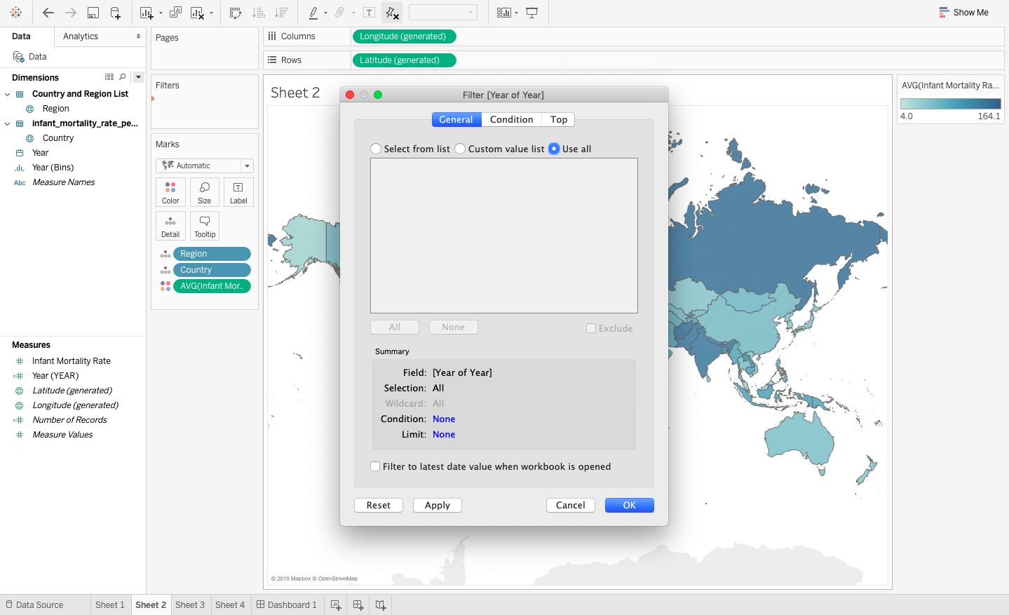
You also add the year filter to the filled map chart as you can see in Figure 15, with the option to select multiple or all years within the view rather than showing the average infant mortality rate across all available years. This allows the viewer to create a custom view of the map based on their selected year, and dynamically update the colors on the map that represent the infant mortality rates averaged across the selected year or years.
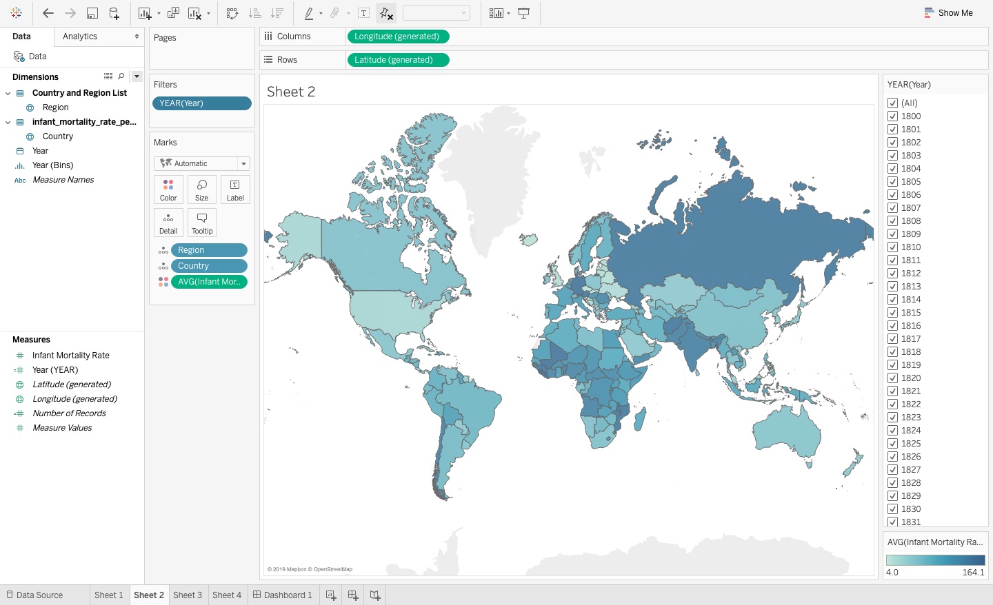
To add the Years filter:
- Go into the map worksheet and put a filter on the filters shelf.
- Select all the years, and then select to show the filter.
- Setting this up as a drop-down list has many benefits, including taking up less space. I'd also recommend the drop-down list because you can see that the single list takes up a great deal of space and doesn't do much for you.
The drop-down list is shown in Figure 16.
I'll revisit the filter options in much more detail later when you set up the dashboard.
Applying Color Effectively
In Tableau and many other data visualization platforms, the application automatically assigns a color palette to the chart. However, using the default option may not present the best color scheme. To leverage color effectively, you want to limit the color scheme you use (as contradictory as that sounds) because strategically applying just a few colors not only makes the visuals easier to read, but also allows users to focus on key trends and numbers.
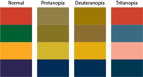
Color-blindness is a visual disability that affects the eyesight abilities of one in ten men and a smaller group of women. You may be color-blind yourself or work with someone who is, or you may not even realize that this impairment is among your colleagues and peers. If you look at the diagram in Figure 17, you can see how orange and blue navigate around issues with vision impairment pretty easily. Green and red, on the other hand, look the same for those with color-blind impairments. Also, remember that, like, many other disabilities, it occurs in a spectrum rather than an absolute impact.
Accounting for those with color-blindness can serve as a starting point to selecting your own color palette. Tableau has a color palette that you can see in Figure 18, specifically offering ten color options to choose from.
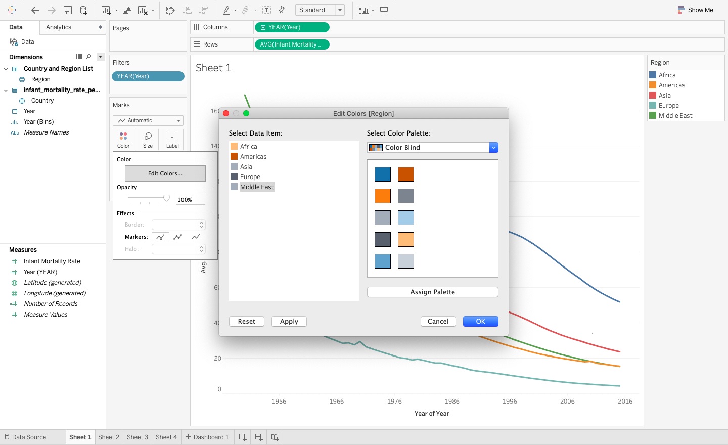
You want to give a unique color for each region so that even those who are colorblind can distinguish the regions in the line charts, as seen in Figure 19.
You update the filled map in Figure 15 to use a diverging Orange-Blue color scale with a very light gray serving as the color representing the midpoint. Although blue represents lower infant mortality rates and orange represents high infant mortality rates, the key part about setting up this color scale is selecting what value to use as the midpoint (Figure 20).
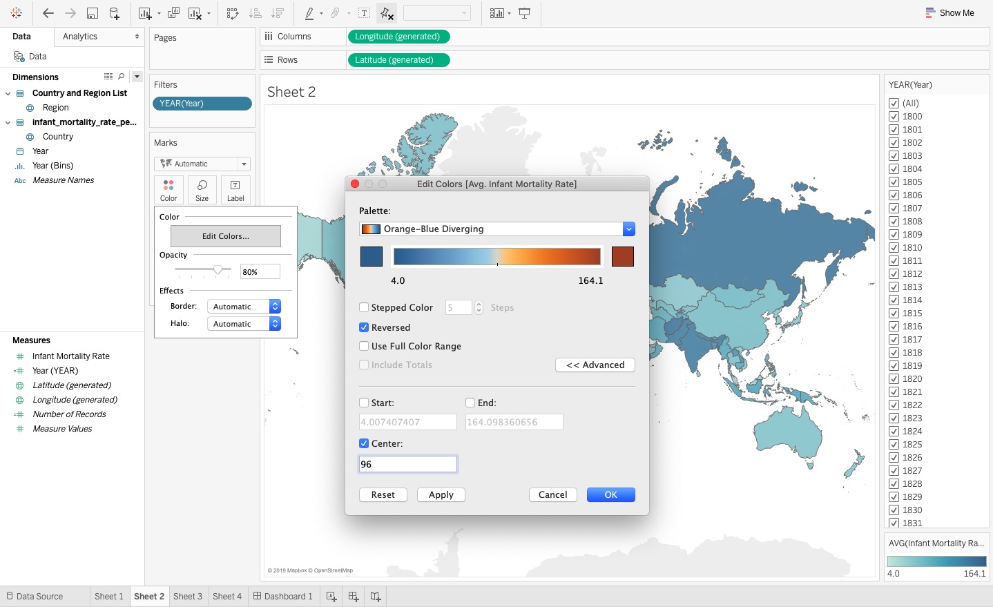
In 2015, the country of Angola experienced the highest infant mortality rate of all the countries, at 96 deaths in the first two years of a baby's life for every 1000 live births. I decided to set the center or midpoint of the color scale to this rate because it allows the viewer to put in context how historical infant mortality rates across all countries compare to today. It allows the viewer to see that although unfortunately Angola still lags behind other countries in population health in today's world, it still represents an improved infant survival from historical infant mortality rates across a two-hundred-year time span as you see in Figure 20, including a lower mortality rate than a developed country, like Germany, saw historically.
To change the colors on the filled map (Figure 21):
- Go to Sheet 2 and click on the Color Marks card.
- A dialog box opens up where you select the Orange-Blue color scheme, and then select to reverse the colors so that blue indicates lower rates and orange indicates higher rates (Figure 20).
- To change the midpoint that the color scale uses, go to the Advanced options and put a check mark next to the center options, where you can now type in 96 as the value to center the color scale.
You can then apply this same Orange-Blue color scale palette to the highlight table from Figure 12 to better analyze two aspects of the infant mortality rate data: rankings between countries and improved health outcomes over time. You use the same midpoint as for the filled map with Angola's 2015 infant mortality rate of 96.
As you see in Figure 22, although all the countries in the most recent time frame of 2010 to 2015 have better infant survival rates than Angola (indicated with the blue cell color), when you look back at historical trends for these rates, some of the most developed countries today, like Japan and Singapore, had higher infant mortality rates only fifty years ago than Angola does today. Even developed European countries, like France, Germany, and Austria, also have much lower rates. Although you may lament about the difference between the healthiest and the sickest countries today, you need to remember that these outcomes still represent a much healthier world for everyone now than less than half a century ago.
In highlight table, to update the color scheme (Figure 22):
- Click on the Color Marks card to open up the selection options.
- Select Orange-Blue diverging, reverse the color scheme, and then, on the Advanced options, select Center and put in 96, which is the infant mortality rate for Angola in the most recent year, 2015.
- To remove the extra blue spaces for the null values, right click on the mortality rates with the colors and select Filter. Then select the Special options by choosing the button on the far right and selecting Non-null values.
- You also want to remove the text values, so select the second infant mortality aggregation with the text icon next to it and delete it.
If you run into problems where Tableau won't let you remove the color from the null cells (I ran into this a time or two when testing), I suggest trying to recreate the visual again or going back to previous steps and removing the null values at that point (you may have to test different options). If the visual flips the rows and columns but removes the nulls, you can easily flip it back into the positions you want.
Placing the Visuals on the Dashboard
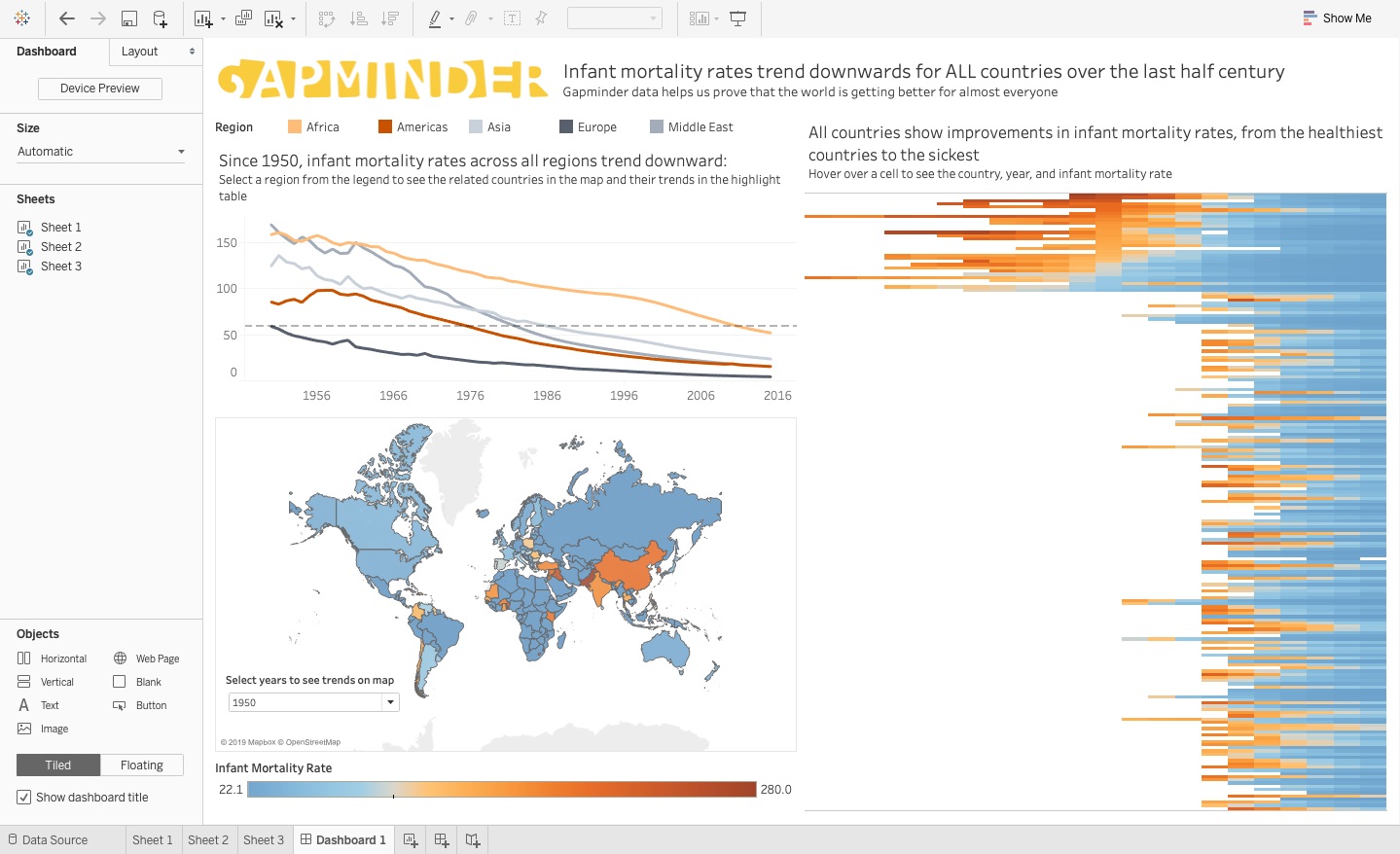
So far, you've updated the chart type and formatting of individual visuals, but you now need to take a step back and see how all of these visuals come together in a single consolidated dashboard with which the viewer can dynamically interact. After making several strategic design and formatting decisions for the visuals, you end up with the dashboard you see in Figure 23.
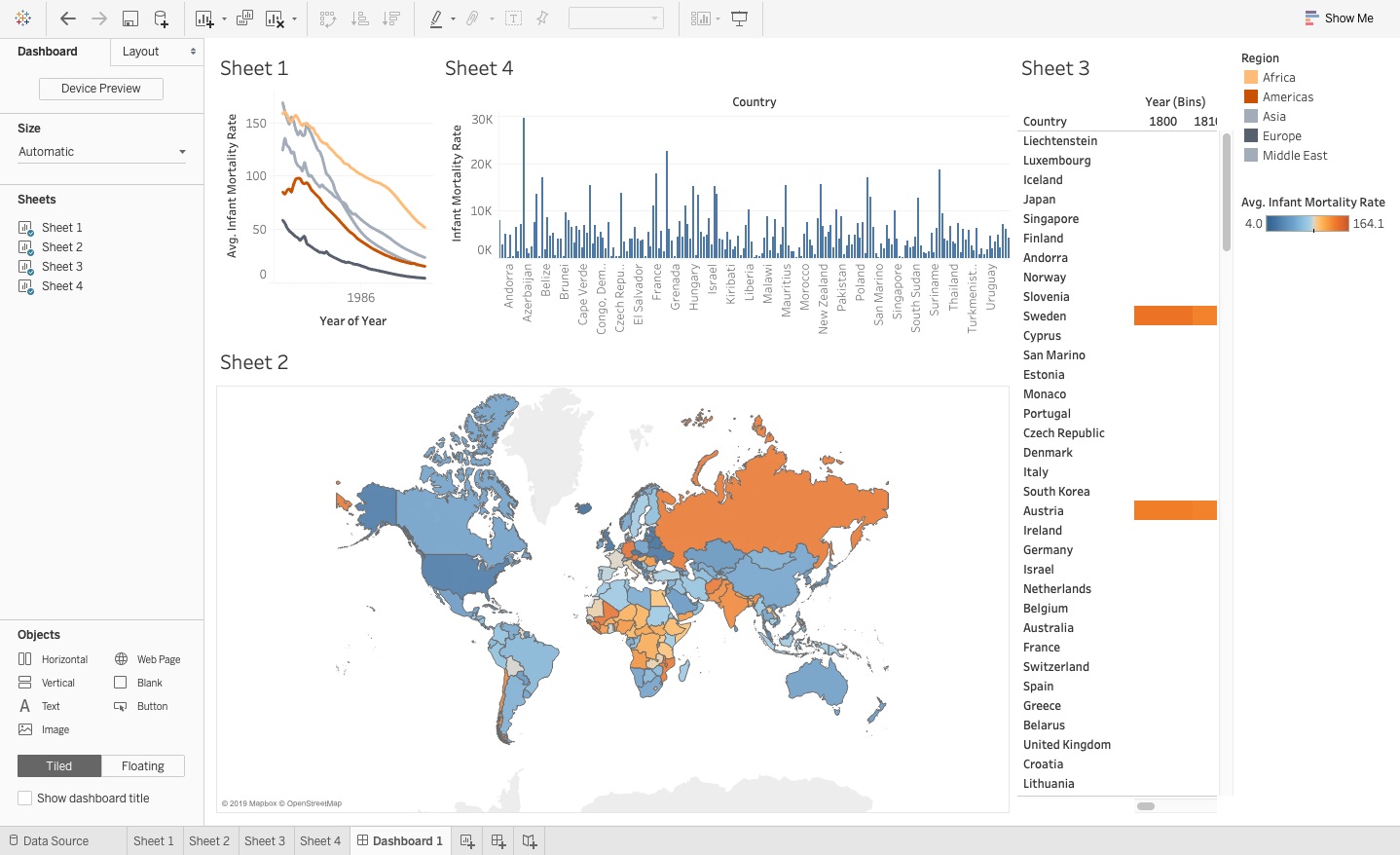
You want the dashboard to line up in a way that's easy to read by purposely deciding:
- To make all of the chart big enough to view without scrolling or panning in.
- To place visuals, such as the highlight map, to the side to effectively create a border.
- To use a maximum of three large visuals to avoid clutter.
You now need to make adjustments to get everything to fit together after updating each visual to get the updated dashboard, as you see in Figure 24.
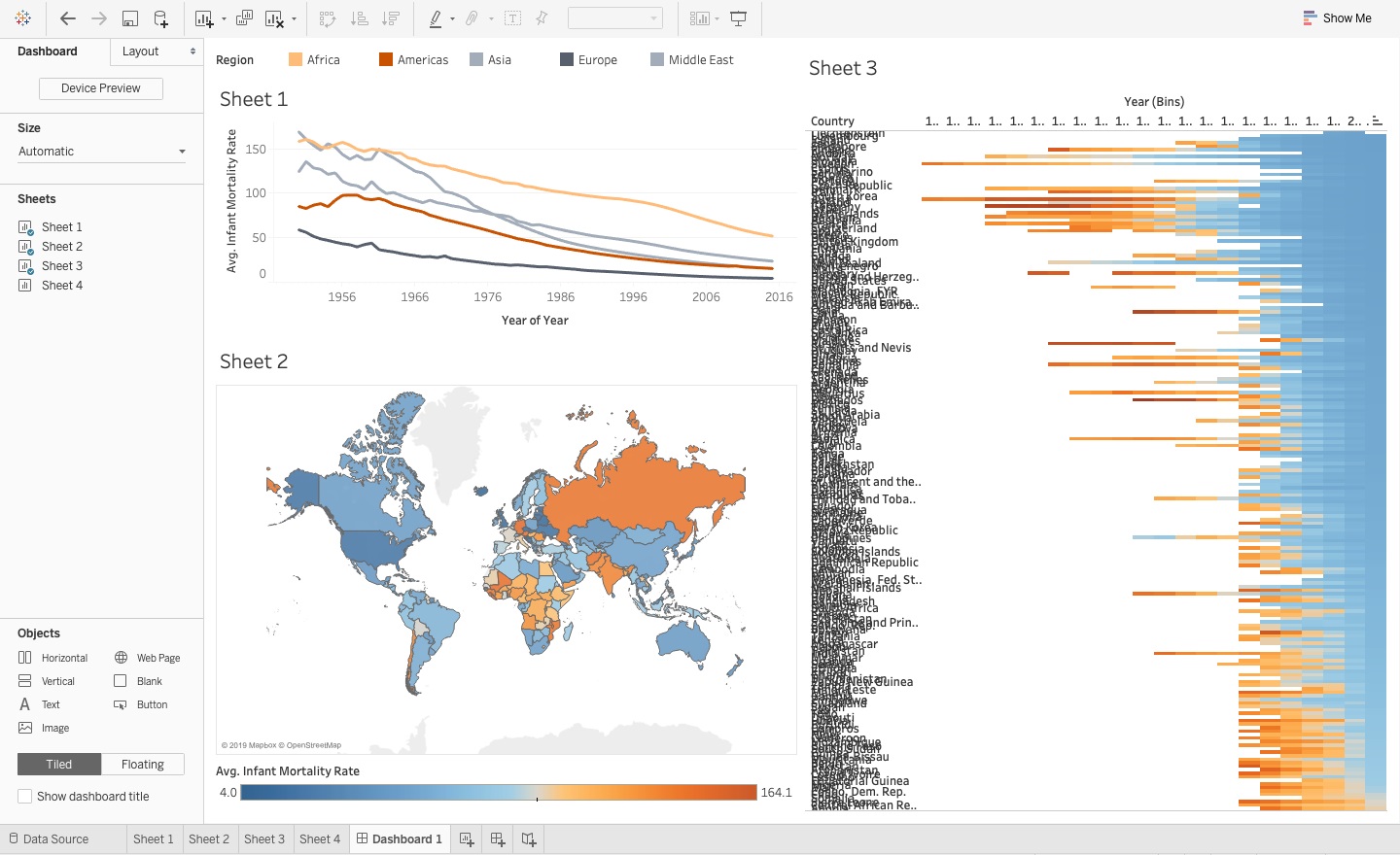
To make these changes:
- Remove Sheet 4 from the dashboard by selecting the visual so you can see a box around it and then click on the X in the upper right-hand corner.
- Take the Region key on the upper right-hand side and drag it over so that you can see it on the top of the line chart, and then adjust it to make it smaller. You can also adjust the width of the region names by clicking into the legend and when you see an arrow pop up, drag the width of the text field to where you want.
- Now drag the infant mortality color gradient to underneath the map and to the left of the highlight table. Drag the top of the scale up to put the label above it.
- Remove the layout container from the right-hand side of the screen where the legends used to be by clicking on it, then clicking on the X.
- To make the highlight table bigger so you can see it in a bigger picture on the dashboard, select the container and pull it over until it almost takes over half the screen on the right-hand side.
- To get the highlight table to fit on an entire view, select the chart, then click on the down arrow at the edge, select Fit and choose Entire View.
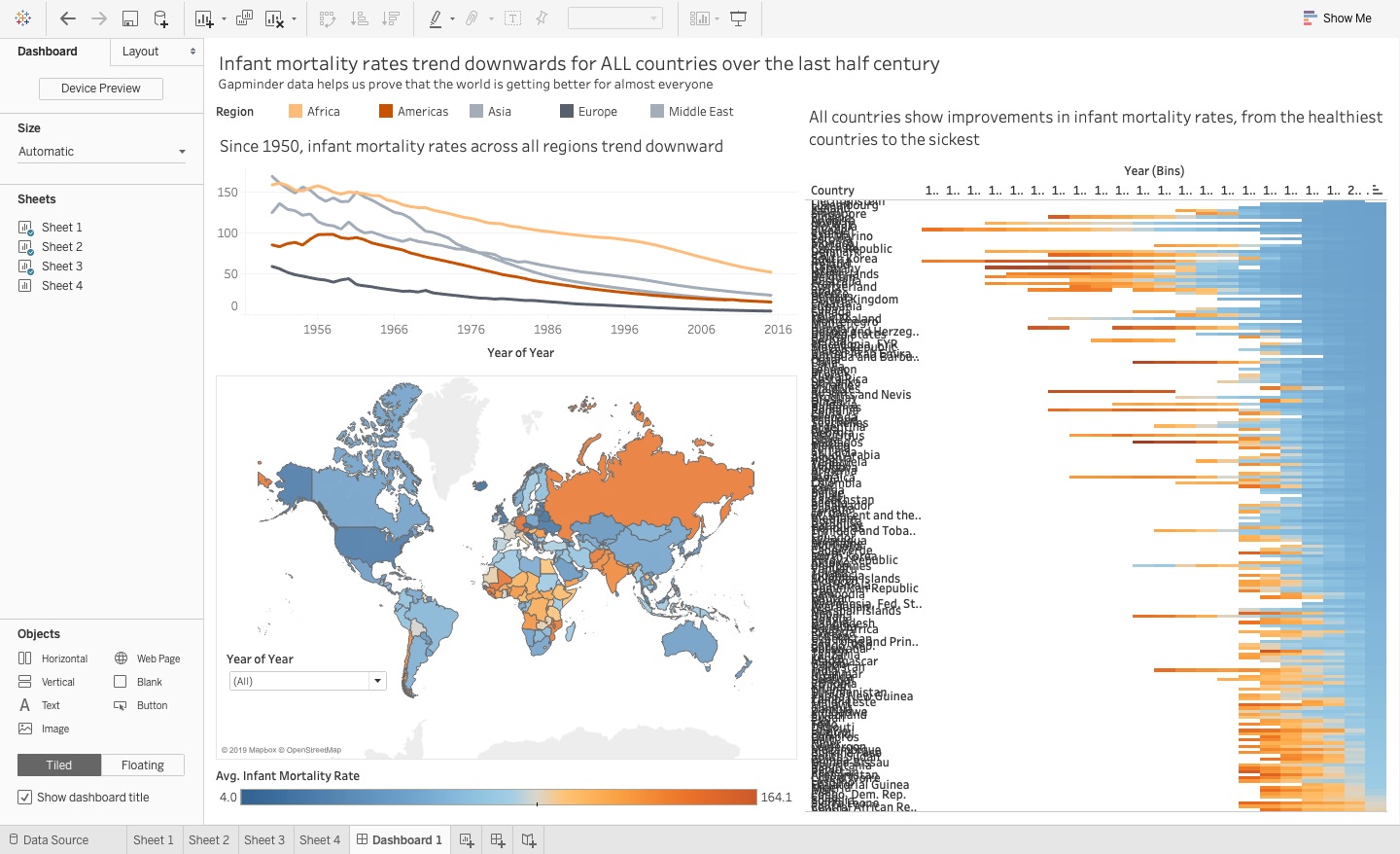
Put Titles and Labels on the Dashboard
Although you already made strategic design and formatting decisions to improve the dashboard, you still need to effectively label these components or visuals so that the viewer understands relatively quickly exactly what each component represents, as you see in Figure 25. Although you may know what Sheet 1 does because you designed the visual, you can't assume that the viewer does as well.
You can also add the year filter to the map chart that allow you to see the infant mortality rates around the world for the selected year or years. This allows the user to dynamically change their own map view in the dashboard themselves, as you saw in Figure 25. The drop-down list takes up less space than the list option, and the floating option frees up even more space to use for the rest of the visuals on the dashboard.
You'll want to add:
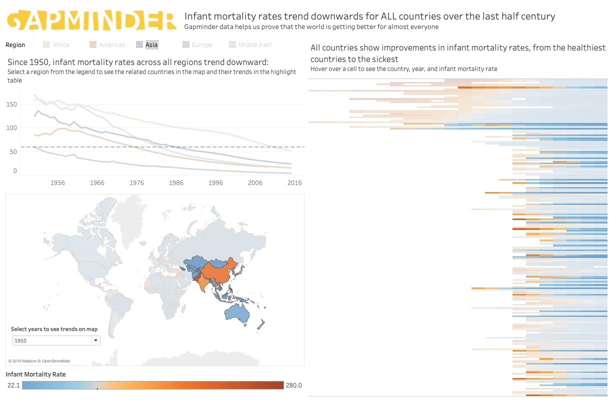
- A title to the entire dashboard to explicitly tell the viewers what data they're working with and give them a nudge to indicate that falling infant mortality rates represent improved health outcomes, and also to give them context on the trends and encourage them to learn more.
- Titles on individual visuals, where needed, to provide context on what they see and how to potentially think about the results and interact with the data.
- The Years filter that enables you to see different views of the filled map by selecting the years you can see.
Determine whether you can remove some titles, too, such as the map title, because you already know it's a map
The steps to add titles are:
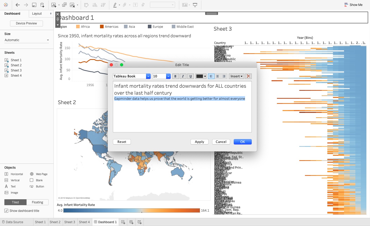
- In the Dashboard 1 tab, select the Dashboard menu at the top, select Show Title where you can input the name Infant Mortality Rates Trend Downwards for ALL Countries Over the Last Half Century and the subtitle Gapminder data helps us prove that the world is getting better for almost everyone (see Figure 26).
- Make the title in size 14 font and the subtitle details in size 10.
- Add names to the visuals. Double click on the title for Sheet 1 and in the dialog box, enter Since 1950, infant mortality trends across all regions trend downward, and set the font size to 12.
- Next, double click on Sheet 2 and delete all the text in the dialog box so you no longer have a title on the map.
- Double click on Sheet 3 to change the name of the highlight table to All countries show improvements in the infant mortality rates, from the healthiest countries to the sickest and set the font size to 12.
- Select the map visual container, then click on the down arrow on the outside frame, select Filters, and select the Year of Year from the list, where you now see the filter on the far right.
- Select this filter container, click on the down arrow, and choose Multiple Values (dropdown). Then click on the down arrow again, select Floating, which means that you can move the filter over the map to select the year, and you can drag it over to the bottom of the map where it doesn't directly sit on top of any countries in the map.
Adding Elements of Analysis
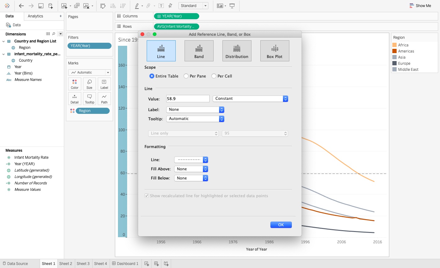
In the line chart in Figure 19, you saw that since 1950, average infant mortality rates across all regions trend down, which indicates an improved population health outlook. Similar to the way you set up the blue-orange color scale for the filled map and highlight tables in Figure 21 and Figure 22 with the highest mortality rate in 2015 as the midpoint in the diverging color scale, you can also use a reference line as another way for the viewer to analyze these rate trends. In 1950, you can see that the healthiest region, Europe, had an infant mortality rate of 58.9 as you see in Figure 27. By setting a constant reference line at this point on the y-axis, you can see that although other regions may lag behind Europe in terms of relative improved health outcomes, you can use this number as a benchmark to show what you could call a time delay in this trend.
To add a reference line to the line chart:
- Click on the y-axis and right click to Add reference line.
- Select the entire table, select a constant line, enter the value of 58.9, choose to see no label, and then use a thick dashed line, as you see in Figure 28.
Use Tooltips as a Hidden Design Weapon
Tooltips allow you to increase the capabilities within interactive data visualization applications because you can hide some of the information away from the immediate view of the user, but they pop up when the user scrolls over the relevant data points in a visual. I sometimes think of it like a third dimension that you can add to a two-dimensional dashboard. You can add data to tooltips that you don't see in the visual as well. You can also customize the wording and structure of the tooltips, as seen in Figure 29.
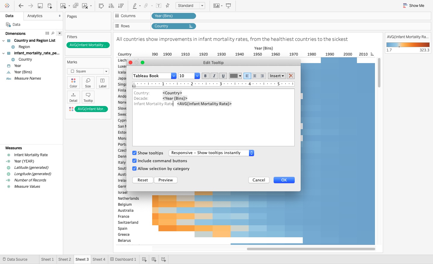
In the highlight table, I find it difficult to read the row and column headers in the visual because there are so many of them in a small space. By pushing the details into the tooltips, as you see in Figure 30, you can ultimately format a clean visual without compromising the design or details behind it.
To edit the text and values within the tooltips:
- Click on the Tooltips Marks card that opens up a new dialog box on the Sheet 1 tab for the line chart.
- Edit the tooltip to refine and summarize what you want to say (you can type in the tooltip box to rename the labels or create sentences). Change the year for the bins to Decade and delete Avg from the mortality rate details. You can also change the details in the map to make them easier to scroll over.
Creating Interactivity Through Instruction Prompts
Businesses decide to leverage data visualization tools like Tableau because of the interactive capabilities that enable the end users to explore and analyze data trends. You want to think about how to enable the user (the customer) to experience the “Ikea Effect” discussed earlier, where they do most of the work by interacting with the dashboard, but still feel that their investment in using the dashboard was worthwhile. Like a furniture pack with components ready for assembly, as the developers of the dashboard, you analyzed, measured, and packaged the pre-made components for the customer before they even receive them.
Now you need to communicate the instructions for how to assemble the product by telling the user how to interact with the visuals within the dashboard. You can't assume that because you know how to interact with the data that they will as well. We need to provide clear instructions that guide them in how they can change filters or click on countries in the map to change the dashboard view.
To help the viewer navigate the dashboard and make the most of using the dashboard, you should use nudging techniques to give them instruction prompts for how to use the visuals. These nudging techniques appear as instructions in the visual or filter title to gently guide them with their selection options and encourage them to explore the dashboard. You want to avoid wordy instructions or difficult procedures to follow. You need to simply tell the viewer what you want them to do, without it coming across in an authoritarian way. Examples include nudging instruction cues that you see in Figure 31 include:
- Adding the Gapminder logo by selecting on the Dashboard tab of the pane on the far left-hand side of the screen, and then selecting Image from the options at the bottom, where a new container opens up in which you can select the image path in the dialog box.
- The logo now appears in the dashboard but looks strange because of the position it currently resides in, so you need to highlight the container and move it to the top left-hand corner of the screen before the title details. This can be quite tricky, so put the logo in with a container and move the dashboard title into the blank container.
- Selecting a year from the filter to change the map view.
- Clicking on a region to filter the entire view.
- Thumbing over a color cell block in the highlight table to see more details.
To add instruction prompts and the final formatting details to the dashboard (Figure 29):
- In the title of the line chart, double-click to edit the title, and, underneath the title, add the instructions by entering the text Select a Region from the legend to see the related countries in the map and their trends in the highlight table. Make this addition font size 8 so the users can see it, but it's not too prominent.
- In the filter for the map, double-click on the year filter, and change the title to say Select year to see trends in map. You can also double-click on the legend below to update the Avg in the legend title to Average.
- Now in the highlight table, double-click on the title and add the text Hover over a cell to see the country, year, and infant mortality rate. Again change the font size to 8.
- You also want to remove the labels from the highlight table because you can't even read them in the first place. Right-click on both the column labels and the row labels separately and choose to remove labels for both of them.
- Also remove Sheet 4 because the dashboard doesn't use it as a visual.
- You can add the Gapminder logo to the dashboard by first putting an empty container (found on the bottom left) and dragging it onto the canvas. Push it into the position next to the dashboard title so they share the same space. Now keep this layout container selected and choose Image from this same selection option box, and point to the location where you saved the Gapminder logo. Now adjust the chart to see the entire logo as well as the other visuals without them pushing one another out.
- Now you need to set up the interactivity between the charts so the instruction prompts work. To do so, go to Sheet 2 and make sure to add the Region to the Details Marks card, so that the region legend can filter this map. Do the same to the highlight table by going to Sheet 3 and adding the Region to the Details Marks card.
- Now go back to the dashboard and select the line chart to highlight its container. Select the filter icon to set up this chart as a filter for the other charts.
- Make sure that you can see all your visuals. The best way to do this is to make sure to leave enough white space between the legend fields and the visuals, and then upload to Tableau Public Online to make sure it fits as you anticipated. If it doesn't, go back to the dashboard and make adjustments based on what you saw pushed out of place. This make take a little bit of practice!
Now that you've set up the dashboard, you can put yourself in the position of the user and test it out. In Figure 32, you see Asia selected as the region in the line chart legend. This creates a new view of the data that highlights key trends and analysis for the Asia region. You can also select a single year in the map to see the Asian countries' health for that year. Choosing Asia filters all three charts, and you can see in the highlight table the disparity between the rankings within the Asian countries.
You maximize your dashboard's influence by taking the initial Tableau dashboard and strategically making changes to update the design, formatting, and interactivity. This, in turn, increases the user's understanding and interactions with the dashboard interface and the likelihood they will use it by letting them take ownership in changing the views. Designing an effective dashboard gives flexibility. I encourage you to take these best practices techniques and use some creativity to set up and experiment with visual options, then see how the users respond and go from there!