


With WPF and Silverlight, Microsoft provides both Windows and Web developers with powerful technologies to create rich, professional, and exciting user experiences. However, in general, developers aren’t graphical designers, leaving most developers wondering how to cope with this new world of designed interfaces and polished user experiences. But fear not! With Expression Blend, Microsoft provides a great tool to create such UIs, and even developers with no graphical talents whatsoever can learn a few techniques that allow for better looking applications.
One of the things about WPF and Silverlight that amazes me is the polarity in quality produced. One can watch a demo at a keynote of a major event such as PDC and see some of the most amazing user interfaces ever conceived. But then at the same event, you could sit in another session that covers WPF and/or Silverlight and see an absolutely sound presentation (technically), but it looks like a 3-year old just slapped it together (no offense meant to all the 3-year olds reading this article). You can see the same thing in production applications. You can find very polished applications while others come across as complete messes with awful artwork and intrusive animations that make you want to reach for sea-sickness medications.
The root problem is not unique to WPF and Silverlight, but it is shared by many powerful technologies: They enable an extremely wide range of possibilities, both in the positive and the negative. It therefore takes expert knowledge to fall on the desirable end of that range. WPF and Silverlight make the problem particularly pronounced because they require development skills as well as graphical skills. This combination of talents is hard to come by, which means that most people working with WPF/SL are developers who are now tasked with creating something beautiful that is also considered an “exciting experience”. In the past, the typical developer skill set only called for functional things and the term “experience” was only called upon when users started to pound tables in frustration over a bug or missing feature.
So how does a developer cope with this situation? Well you could take art and design lessons, and that certainly wouldn’t hurt if you have interest and motivation. However, in this article I’ll show you a simpler way: I’ll teach you a few graphical tricks that require no real artistic talents. Almost like “paint by numbers”, really. Just like following recipes can make you a decent home chef, following some basic guidelines can help you create decent WPF/SL experiences. Over time you’ll create a small collection of such tricks-a little cookbook of sorts for some graphical WPF/SL home cooking. (And for the more unusual things, you can always call in the designers in their black turtlenecks).
An Example Application
To demonstrate a few of these points, I created a small but realistic example application. The application draws from a real-life middle-tier that I’ll teach you how to build a WPF interface for. You can apply these techniques to Silverlight as well. I picked WPF because I had to pick one of the two technologies to keep the example at a reasonable size. Note that the downloadable code sample for this article includes a scaled-down version of the middle tier to eliminate dependencies on real-life databases and frameworks. However, the example as described here was explicitly based on a real application to make sure it is representative.
The application uses the middle tier of team-management software that my company used on our upcoming JockTock product and website (www.JockTock.com), which allows hobby sports teams to organize themselves. In this particular case, the example revolves around ice hockey. The middle tier can serve up lists of teams as well as the player rosters for each team. The goal of this example application is to pick up that data in the WPF UI and display it in a professional manner that takes advantage of WPF features.
To start out, I created a WPF solution in Visual Studio 2008 using the .NET Framework 3.5. The solution only includes a simple main window which displays a list of teams as well as all the players of that team once the user clicks on one of the teams. Since the existing middle tier provides all the logic, I don’t have to write much code. I can do most of the work on the UI and its design using Microsoft Expression Blend. However, I generally like to start out setting up my WPF/SL projects and solutions from within Visual Studio as that seems to create better starting points for sophisticated applications. (Solutions created by Blend seem to be more geared towards graphical designs, rather than complete applications.)
One of the nice things about Blend is that it uses a project structure that is identical to the structures used by Visual Studio. This means that it is possible to switch back and forth between Visual Studio and Blend seamlessly, allowing me to write code in VS and do all my design work in Blend. Microsoft originally created Blend for designers. You can certainly use Visual Studio to build WPF/SL interfaces directly in Visual Studio. However, I personally favor Blend for all WPF/SL UI editing, even though I am not even close to calling myself a designer. I simply find the Blend UI more productive for any UI editing task. (Your personal preference may vary.) For this reason I will use Blend for all UI editing tasks in this article. Some, but not all, edits can also be made in Visual Studio. The same techniques as I show here with a WPF application also apply for Silverlight.
In the example application for this article, I want to provide two lists of data: I want the left side window to show a list of teams that the user can choose from. When the user picks a team from that list, I want the right side window to display the players for the selected team. There are more players assigned to each team than there are teams, so I would like the list of players to take up more room than the list of teams, but I would like the user to be able to resize the two areas.
Creating the Basics
WPF provides a great way to create the basic mechanics for such a UI. When one adds a new window object using either Blend or Visual Studio, the created default includes a Grid layout element. Grids are very useful, but they are also very confusingly named. When one hears the term “grid,” most developers think of lists of data organized in columns and rows. In WPF, a grid has nothing to do with displayed data. Instead, a Grid is a layout element-a way of organizing other controls or elements inside the window (or any other container). By default, a Grid has 1 row and 1 column, meaning the entire window is a single cell, which behaves very much like a window in WinForms would: You can drop controls into the cell and place and size them. Grids really start to add some value when you add more cells. In the example application, the left and the right side of the window are two independent areas. When I create a second column in the Grid it will provide a way to treat both sides of the window almost as if they were independent windows. You can (for instance) put controls into the “team” side of the window and arrange them within their cell. If that cell changes size for whatever reason (perhaps because the user resizes the area, or maybe because the window changed in size, or perhaps because you decide later to add another cell), you only have to worry about keeping the controls aligned and sized properly within that cell. This simplifies the overall setup of the interface. For this reason, Grid elements should be your default choice for layout in WPF.
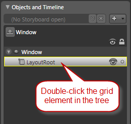
Expression Blend makes it easy to add grid columns and rows in a visual way. Simply select the grid in the object tree by double-clicking in it (the grid is a child of the window and appears as such in the object tree), which highlights it in yellow. It is important that the grid isn’t just selected, but it is selected for child element editing, which is what the yellow outline indicates (Figure 1). If you’ve only selected an element, you can manipulate the object’s properties, but in order to add child elements such as columns, rows, or even other controls like buttons, you need to select the grid with a double click.
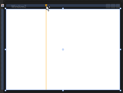
Once you’ve selected the grid in this way, the visual design view shows “bars” above the top end left hand edge of the grid. You can move the mouse over that bar to get an orange “ghost” indicator for a new grid row or column (Figure 2). Click where you would like the new column to appear. In the example for this article I’ll choose about 1/4 of the width of the window. Once I’ve added a column I can change the width by using the mouse on the design surface by dragging the column at the very top. I could also change the width of columns (or the height of rows as the case may be) through the property window (Figure 3). To do so, I’ll make sure I’ve selected the grid in the object hierarchy and click on the “…” button next to the ColumnDefinitions property in the Layout category. (Note: You may have to extend that category to see the property.)
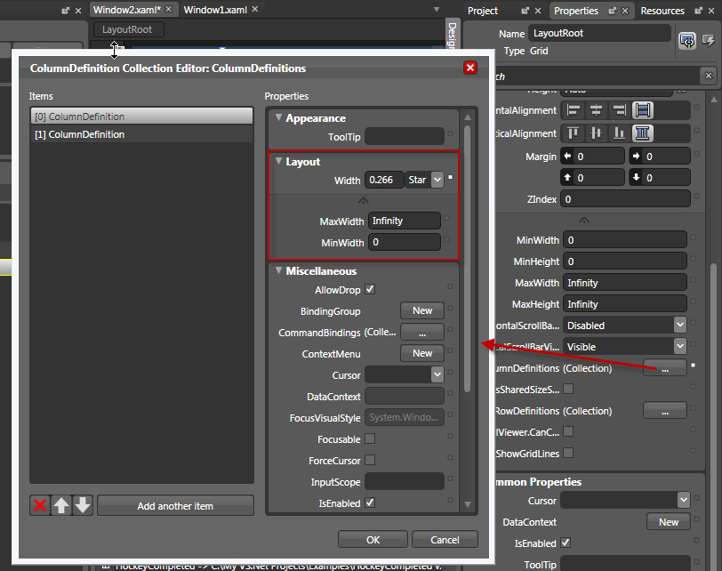
Note that by default, the width of the column will be set to something like “0.266 Star”. WPF lets you define the width of columns in either pixels or stars (*). Pixel widths are an absolute width definition based on logical pixels (1 logical pixel is 1/96th of an inch, which maps to 1 pixel on a standard monitor, but may map to something else on high-res monitors). The star definition is similar to percentages. For instance, you could set column 1 to be 25* and column 2 to be 75* to achieve a 25% / 75% spread. However, unlike percentages, star definitions do not have to add up to 100%. For instance, you could also achieve the same spread by setting the first column width to 1* and the second column to 3*. This often simplifies the overall setup. For instance, if you also add a column on the right of equal width to the one at the left, you could simply add one more column with a 1* width definition, rather than having to reset the percentages of all columns. This is especially useful in complex scenarios.
As stated above, I also want the two sides to be resizable, so I’ll use a GridSplitter. These objects automatically dock to the side of a cell and provide the resize/slider grip for the user. When the user moves the slider, the grid cells automatically resize. For instance, you could simply drop a GridSplitter into the second cell of the grid and dock it to the left edge of that cell. Unfortunately, the splitter has a certain width (typically about 3 pixels), which you have to subtract from the available area in the second cell, making the cell layout significantly more complex, especially if you want to change the width of the splitter or you want to remove it entirely. A more manageable approach is to add an additional and very narrow cell in between the two existing cells and use it exclusively for the splitter.
To do so, add another grid cell before the second one and set its width to 3 pixels. Then, choose a GridSplitter from the toolbox and put it inside the second cell. Set the margin of the splitter to 0 on all four sides and make sure you set it to stretch horizontally and vertically. Also, you should set the Height and Width properties need to “Auto” (you can reset that value to auto by clicking the tiny white square to the left of the property value, which brings up a menu). This ensures that the splitter uses up the entire column area. This approach of creating a special column just for the splitter greatly simplifies grid splitter management. You should always place GridSplitters in their own columns or rows.
Note that you don’t need to change the width definition of the two previously existing columns. The definition for this example simply means that you have a column of 3 pixels width, regardless of the overall width of the grid, and the other two columns use up the remaining width at a 1:3 ratio. This demonstrates how much easier the star-system is than a percentage-based system. What is the percentage of a 3-pixel wide column? There is no right answer to this question since that depends on the overall width of the grid (and the window that hosts the grid). This was one of the classical problems of percentage-based definitions (as used by HTML for instance) which has been solved elegantly with the star system.
You can also inspect the definition of the UI so far in its XAML form (which is how WPF/SL UIs are defined both by Blend and Visual Studio), by clicking on the XAML tab. The following snippet shows the grid part only:
<Grid x:Name="LayoutRoot">
   <Grid.ColumnDefinitions>
      <ColumnDefinition Width="1*"/>
      <ColumnDefinition Width="3"/>
      <ColumnDefinition Width="3*"/>
   </Grid.ColumnDefinitions>
   <GridSplitter Margin="0,0,0,0"
         HorizontalAlignment="Stretch"
         VerticalAlignment="Stretch"
         Grid.Column="1"/>
</Grid>
Adding Controls, Data, and Behavior
Now that you have the basic setup for the layout in place, I’ll show you how to add controls. For this example, I’ll use ListBox controls to show a list of teams and a list of rostered players. For standard Windows Forms, developers use list boxes to display simple lists, most of which are short and ugly. In WPF/Silverlight on the other hand, developers use list boxes as workhorse objects to display large amounts of data in very flexible ways.
For a start, add one Listbox object each to columns 1 and 3. Make sure you set their width and height to “Auto” and you set vertical and horizontal alignments to “stretch”. Also, set the margins of the outside edges to 8 pixels, and on the inside edge (the one near the grid splitter) to 2.5 pixels (since the grid splitter automatically adds some “whitespace” between the two list boxes). This creates a nice overall appearance, no matter what size the main window has, and no matter how the user chooses to size both “panels”.
Now I want to discuss binding the two lists to data. Given the right preconditions, WPF/SL can bind to data in a downright simple way. For instance, if you have an XML file that acts as a data source, you can simply bind a list to that. Also, if you have a .NET object that acts as the data source, you can bind that object to controls without the need to write any code. However, such an object needs to be creatable without any involved constructor parameters or any method calls of any kind. In other words, you couldn’t call a business object that returns a DataSet. Instead, a simple New operation needs to suffice.
In the real world, you are not very likely to use XML files as data sources for sophisticated applications (maybe XML is served up by a web service, which is a more likely scenario). Most applications use objects of some sort. However, most scenarios require involved method calls or instantiation parameters to indicate what data you want to load. However, in my example for this article, I actually happen to have a team data object that can be instantiated without any parameters. On creation, that object loads all teams from the database and exposes it in the form of a collection (the object is a collection). This is very convenient for this example, but it is somewhat unusual. I will also show you how to call more common data sources when you see how to populate the second list showing the players.
To bind the left list to data, right-click on it and select “Bind ItemsSource to Data…”. This launches the Create Data Binding dialog box shown in Figure 4. Click the “+ CLR Object” button to get a list of all CLR objects available in the current project that can be used as data sources. (Note: Make sure you have added a reference to your middle-tier assembly in your project). Close the dialogs and run the application (press F5 either from Blend or Visual Studio after saving all files) to see the data binding in action. At this point, the list does not look very good since you simply bound to a list of TeamBusinessEntity objects without specifying what fields from within those objects are to be displayed. Therefore, only the default ToString() result is displayed for each row in the list, which is simply the name of the object. To fix this problem and display the content of a specific property (or multiple properties), I’ll show you how to define a data template.
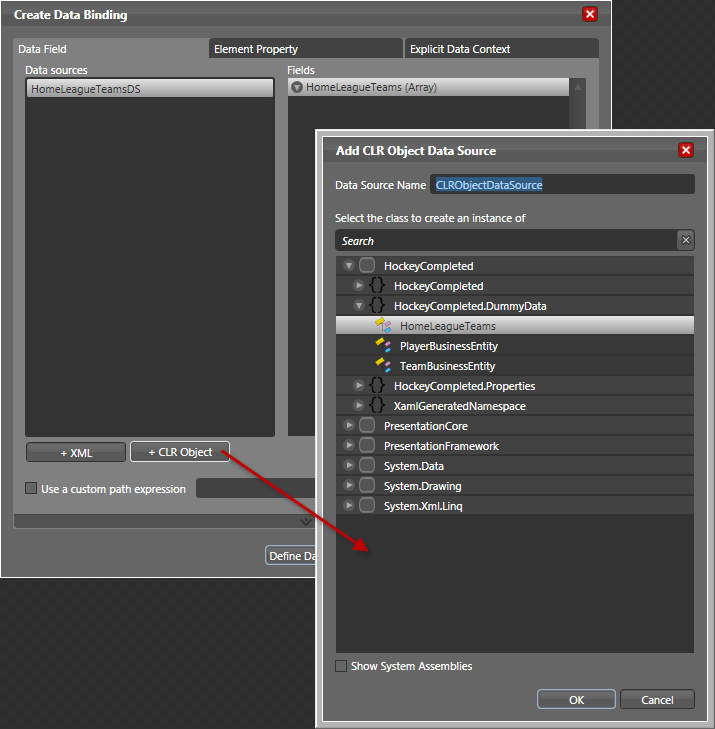
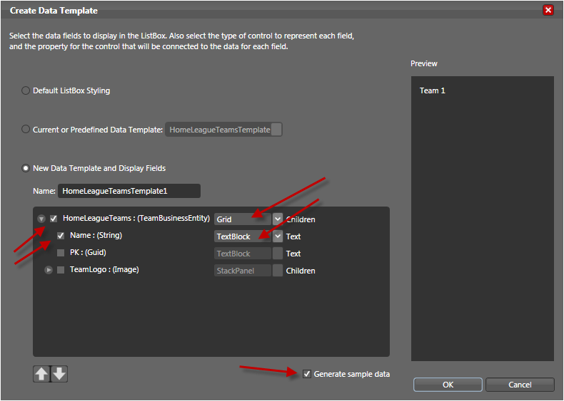
Right-click on the left list and choose to select the option to bring up the Create Data Binding dialog box (Figure 4) again and the pick the “Define Data Template” button. This launches the Create Data Template dialog box shown in Figure 5. To define a data template, you can pick one or more members of the data source objects to display inside a list item. List items in WPF/SL list boxes can be complex items. In fact, each list item can be a Grid object (which is not the default and thus has to be picked explicitly), which-as you saw above-is its own microcosm that can include just about any other object. Using a Grid as the container object will ultimately allow you to create an elaborate design for each list item. Initially, however, all I’ll put inside that grid is a text block that is bound to the team name. Finally, I have also checked the “Generate sample data” checkbox. This will create nonsensical sample data during design time (names of fruits), that nevertheless is convenient to have since it will force the listbox to show items in the designer, enabling me to immediately see the impact of my settings and changes, without having to run the application.
You can now run the application and see the data binding in action, including the correct display of team names. What is missing at this point is the display of the players when a team is selected. As noted above, this is a little trickier than the display of teams because you have to make a call to a middle-tier object to retrieve an appropriate list of players from a potentially very large list of players stored in the database. So you therefore cannot just pick an object in a Blend dialog. Instead, you’ll have to write an event that triggers when the user selects a new item, and this event has to retrieve the appropriate data and assign it to the second listbox as its data source. The following code snippet shows an event handler that accomplishes just that:
private void lstTeams_SelectionChanged(
    object sender,
    SelectionChangedEventArgs e)
{
    if (this.lstPlayers != null)
    {
        var teams = this.lstTeams.ItemsSource
                    as HomeLeagueTeams;
        Guid teamId = teams[
            this.lstTeams.SelectedIndex].PK;
        PlayerList players =
            new PlayerList(teamId);
        this.lstPlayers.ItemsSource = players;
    }
}
You should wired up this code to the SelectionChanged event by double-clicking that event in the event list in Blend (the event list is the secondary mode of the property grid), which automatically switches to Visual Studio (or launches it if you haven’t started it already) and creates the empty event handler code.
The code itself makes sure the player list has already been initialized (this code could get called during initialization of the team list before the player list has ever been created). Then, the code retrieves a reference to the data source, which allows access the primary key (PK) of the currently selected team, which is then used to load a PlayerList business entity, which is a middle-tier object that represents a list of players. (Your implementation of the middle tier may vary drastically, but the overall idea of writing some code that ultimately returns appropriate data remains the same). The returned data is then assigned as the items source of the second list. (Note that I used Blend’s property grid to assigned names to both listboxes.)
If you launch this application, you will see that this now works, except for a flaw that is identical to what originally happened to the first list: Instead of player names, the list on the right only displays a list containing the object name for each bound object. The root problem is the same as before: You now have a list of data that is bound to the user interface element, but you don’t have a data template that defines which data elements to show in each list item. You’ll have to fix this problem using a different technique than before, however, because you cannot go through Blend’s data binding dialog box. You could create a new data template from scratch by right-clicking on the second listbox and pick these menus options “Edit Other Templates > Edit Generated Items (ItemTemplate) > Create Empty”. However, I have a simpler trick to apply: Since I already have a similar template in the first listbox, I can simply apply that template, save it as a new template, and then modify it to make sure that I bind the text block to the right property. To do this, right-click the list box and choose these menu selections “Edit Other Templates > Edit Generated Items (ItemTemplate) > Apply Resource” and then pick the one you created before. You should only have one template if you’ve followed along.
At this point, both lists use the same data template, which is now shared between them. This is not exactly what I want because the second list binds to a differently named property. While each team name is simply stored in a “Name” property on the data object, player names are stored in a “SearchName” property. So I’ll change the binding expression. If I do that in the shared template, however, I’ll break the first list. To solve this I’ll save a copy of the assigned template, which gives the second list its own version of the data template, which I can then modify without breaking the first one. To do so, I’ll right-click the control again and from the menus choose “Edit Other Templates > Edit Generated Items (ItemTemplate) > Edit a Copy…”. I’ll choose a name for the new template and then Blend automatically switches into visual template editing mode. If you’re following along, you can click on the text block and observe how the Text property has a yellow outline in the property sheet (Figure 6). Click the little yellow square to the right of the property value to bring up the context menu and pick “Data Binding…”. In the dialog box, change the “custom binding expression” to “SearchName” and click Close. Run the application again, to see it in its fully functional form.
Adding Design and Polish
You now have a window that is functionally complete. However, I certainly couldn’t call it beautiful, well designed, or polished. Let me show you how to add some simple design elements. For this example, I will stick with a color scheme that is very black, similar to the design chosen by Blend itself, and also by Vista, Office 2007, and other applications. Feel free to substitute a color scheme that is more to your liking.
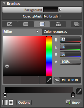
For a start, I’ll change the background of the entire window to black (or another color of your choice). However, I don’t want to set it to a solid black since that generally looks artificial and “computer graphic-y”. Instead, I’ll set the background to a simple linear gradient that starts out pure black in the top-left corner and is just slightly off black in the bottom-right corner. Creating very subtle gradients is generally a simple trick to make something look polished. In nature, nothing is just a single color. When you look at a wall, for instance, due to lighting in the room, its color will be slightly different at different parts of the wall, even though the wall is painted in just a single color. A wall with exactly the same color everywhere would look unnatural to the human eye. Therefore, creating a slight gradient looks very natural and “right.” However, the gradient must be very subtle. This trick only works on a subconscious level. If the user actually notices the gradient, it all falls apart. Therefore, keep the two colors of the gradient very close, and make sure you choose colors in the same color family. A gradient from a dark red to a dark green is never subtle. Figure 7 shows the property settings for black to slightly off black gradient.
Another simple trick with gradients is to not make them run exactly vertical or exactly horizontal (unless you want to simulate a material that has just such a property, as in the glass example below). In the Blend toolbox, you can use the “Brush Transform” tool to easily change the angle of the gradient. Select the root layout grid (you’ll apply this effect to the grid, not the window, although in this example you could have chosen one or the other with equal success) and pick the brush transform tool, which shows a big arrow in the design window. Simply drag the start of the arrow to the top-left corner of the grid/window, and the end of it to the bottom-right corner.
You can now launch the application to see the resulting effect. However, you will quickly notice that not much of the effect is visible, since the list boxes use up almost the entire window. To see more of the effect, simply set the background brushes of both lists to be only 10% opaque. This will make the individual items hard to read for now, but I’ll show you how to address that later. Now, run the app to see the initial design. It isn’t very fancy yet, but you can definitely start to create a unique experience.
As the next step, I’ll show you how to redesign each item in the list to have a more advanced look. In addition, I’ll show you how to take the first step towards achieving separation of UI implementation and UI design. You’ll learn how to put the actual design into a separate file, also known as a resource dictionary. This change lets developers work with the actual window while designers work with the dictionary without stepping on each other’s toes. As an added benefit of this design, you can switch the applied design on the fly and create new skins.
To initiate this process, right-click on the first list and from the context menu, pick “Edit Other Templates > Edit Generated Items (ItemTemplate) > Edit a Copy…”. Enter a descriptive name for the template (such as “TeamListItemTemplate”) and choose the option to define the template inside a resource dictionary. Since you haven’t created a dictionary yet, click the “New…” button in this dialog box, specify a filename for the dictionary (such as “BlackSkin.xaml”) and then choose to store the template in that dictionary.
Once you are in template editing mode (which Blend automatically puts you in as a result of the steps described above), select the grid (the root layout element of the template) and set its width to 150 pixels, and the height to 185 pixels. This explicitly defines the height of each item in the team list. This will provide some extra space for each list item (and a look that is distinctly different from conventional Windows list box items). Since each list item is in itself a grid, you have great freedom regarding how you design each item. Going along with the black skin approach, I chose to implement a black “glassy” look for each item. Glass effects are currently all the rage and can be produced easily without much artistic talent. I’ll show you how.
Add a rectangle shape to the grid. Set its margins to 4 pixels on each side. Change the RadiusX and RadiusY properties to 10 pixels each to create a rounded rectangle. (Note that you can also do this through the visual design surface by dragging the corner radius adorners). Then pick the stroke brush and set it to “No brush” since you don’t need an outline for the rectangle. You do, however, want a background brush, so create a brush that flows from solid black at the top to slightly off-black at the bottom. (The gradient direction is exactly vertically down in this case.)
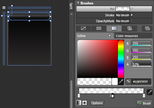
Add a second rectangle to the very top of the item’s grid. Make the height 25 pixels and the right, top, and left margin 5 pixels. Make the corner radius 10 pixels on each dimension as well. Just like before, you don’t need an outline brush, so set it to “No brush”. Now, for the first glass effect, create a vertical background brush from solid-white to solid-white. However, set the Alpha value of the top-color to 15%, making it almost entirely transparent. Then you should set the Alpha channel value of the bottom color to 0%, making it completely transparent. Next you’ll add another gradient by clicking a pixel or two to the left of the center of the gradient line in the property grid. Make it white as well, with an alpha setting of 25%, making it a little less transparent (and thus the white more visible). Add another gradient stop just a pixel to the right, set it to white, and set its alpha value to 10%. This creates quite a sharp edge between these two gradient stops, which have to be close together. (One of the characteristics of glass is that it has sharp edges and reflections.)
Right-click the text block in the object tree and choose “Order > Bring to Front” to show the text label as the top-most object. Then, in the property grid, change its vertical alignment to Top, change the height to 21 pixels, set the font to be bold and 14 points in size. The foreground color has to be solid white, and the text alignment (in the paragraph tab of the Text category in the property sheet) should be set to “Center”. You also need a margin around the object, so set the right and left margin to 4 pixels and set the top margin to 8 pixels.
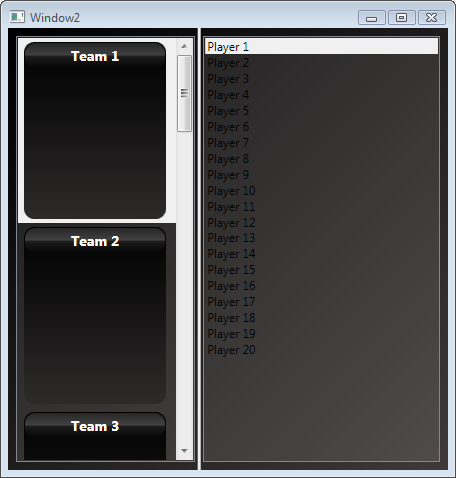
Figure 8 shows the template in design mode. To see the result as displayed in Figure 9, run the application to see the preliminary result.
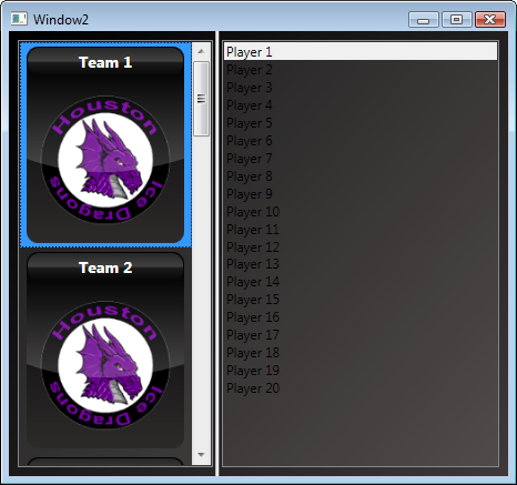
Adding Images and Shiny Logos
Now I’ll walk you through how to add the final piece in this template: the team logo. The middle tier provides the team logo as a property on each team object. However, this property is a GDI+ Bitmap object, which WPF does not natively understand. Also, you’ll have to make some adjustments because you can’t be sure about the image’s size and you want to make sure it fits into the list item perfectly.
I’ll show you how to address the size problem first. Drop a Viewbox element from the Blend toolbox (you may have to go into the “Asset Library” button of the toolbox, which is the bottom-most button and provides access to an extended set of UI elements) and position it inside the grid with a margin of 12 pixels around the left, bottom, and right edges. Set the top margin to 35 pixels so the viewbox doesn’t interfere with the label at the top. Viewboxes are very handy elements since they automatically size everything inside them to take up the exact amount of room provided by the viewbox. Using a viewbox means you can now drop an image object inside the viewbox and it will use up exactly the desired space.
To do so, double-click the viewbox in the object tree. It will now appear with a yellow outline, indicating that all further objects dropped on the design surface will be added as children of the viewbox. Now you want to drop an Image object inside the viewbox, set its height and width to auto (reset of necessary), and then set the margin around the image to 0 on all sides. Then, find the Source property in the property sheet and click the small rectangle to the left of the property value to bring up the context menu. Select “Data Binding…” from the menu. In the dialog box, pick the “Explicit Data Context” page and set the “Custom Expression” to “TeamLogo”. This binds the WPF Image element to the GDI+ image provided by the bound object.
Now you need to convert that image to something WPF understands, in particular an ImageSource object. For this you’ll use a value converter. Listing 1 provides such a converter for bitmap objects. (Note that this converter only needs to convert bitmaps to image sources, but not the other way around.) To use this value converter, expand the data binding dialog and pick the value converter you just created. Also make sure you set the binding direction to “Default”.
Note: Since you’re defining the data template in an external resource dictionary, the dictionary may not be aware of the value converter object. You may have to open the XAML file manually and add your namespace to the XAML definition and a resource reference to the value converter as well. Theoretically, Blend should do this for you, but I have had mixed results getting this to work. Therefore, is the following code snippet illustrates what the first few lines in the XAML file should look like:
<ResourceDictionary
    xmlns="http://schemas.microsoft.com/winfx/
2006/xaml/presentation"
    xmlns:HockeyCompleted="clr-
namespace:HockeyCompleted"
    xmlns:x="http://schemas.microsoft.com/winfx/
2006/xaml"
    xmlns:d="http://schemas.microsoft.com/
expression/blend/2008"
    xmlns:mc="http://schemas.openxmlformats.org/
markup-compatibility/2006"
    mc:Ignorable="d">

    <!-- Resource dictionary entries should
         be defined here. -->

    <HockeyCompleted:BitmapConverter
        x:Key="BitmapConverter"/>
Also, sometimes I’ve had trouble setting all the aforementioned binding properties through the data binding dialog box. In case that fails, you can also touch it up manually in the XAML file. This code snippet shows what that should look like:
<Image Source="{Binding Path=TeamLogo,
    Converter={StaticResource BitmapConverter},
    Mode=Default}"/>
This should do the trick and the logos should now show up correctly and at the right size. As a final tweak, I’ll show you how to add a glass effect right over the logo as well:
Drop another rectangle onto the grid (double-click the grid to make sure you add the child elements to the grid rather than the viewbox again.) The rectangle should have no rounded corners. Set the rectangle’s left and right margin to 4 pixels to use up almost the entire available width. You want to set the top margin to 30 pixels and the bottom margin to 80 pixels. Set the background to be a vertical gradient from white to white, with a top alpha value of 0% (fully transparent) and a bottom alpha value of 15% (not quite fully transparent, providing a slight white hint).
Here comes the trick: With the rectangle selected, right-click to open the “Object” menu and choose “Path > Convert to Path.” This changes the rectangle to a fully editable polygon that just happens to be a rectangle at this point. To edit individual segments of the path, activate the “Direct Selection” tool in the toolbox (second arrow icon from the top), which enables you to not just select a complete object, but edit elements within an object. Then, hold down the ALT key, move the mouse over about the middle of the bottom line of the rectangle, click on it, and drag it down about 10 or 15 pixels. This turns the bottom line into a curve and gives you a curved glass effect overlapping the logo. (You can see a similar effect in the icon at the top-right edge of the Vista Aero start menu, by the way.)
Figure 10 shows the result.
To Be Continued…
That’s it so far. In my next article I will show you how to add more graphical effects and various professional looking animations. I’ll even re-define how listboxes create layout for all their contained items and turn them into lists with an appearance unlike any other you have ever seen in Windows. Furthermore, I’ll show you how to re-style some standard elements that do not quite fit in with the design yet. Later, I’ll even demonstrate how to re-style the application with a completely different look.
So stay tuned. And if you have any questions, feel free to shoot me an e-mail.