


Over the last few years, Android development has made significant changes in how apps are structured, the language used for development, the tooling and libraries that speed up development, and the improvements in testing apps. What didn't change in all these years is the Android UI toolkit.
This changes with Jetpack Compose, Android's modern toolkit for building native UI. It simplifies and accelerates UI development on Android and is a paradigm shift in Android development as we know it. The move to using declarative programming for describing UI is a welcome change and one that is prevalent across platforms with the introduction of frameworks like React for Web, SwiftUI for iOS, and Flutter for cross-platform development.
Motivations behind Jetpack Compose
Jetpack Compose is a complete rewrite of the Android UI toolkit from the ground up. This is a huge undertaking, even for a company at the scale of Google, so it's important to understand why a framework such as Jetpack Compose is even needed.
- The existing Android UI toolkit is tied to the operating system. This means that if the Android team made some new improvements in the View system, we'd have to wait for an Android API release to get these improvements. This typically happens only once a year. Unbundling the view system from the OS makes it easier to quickly fix bugs and bring improvements in a backward-compatible way.
- Some critical Android APIs were created over a decade ago. The development experience and expectations in 2021 are significantly different than what they were when Android first launched in 2008. There's been great progress with the introduction of Jetpack that started to break down core components into more maintainable libraries. However, the view system in Android has largely remained unchanged. The infamous View.java file, which is one of the most critical parts of the Android views system, is now 30k lines long. This has also made it harder to introduce new patterns and changes.
- The average Android developer workflow involves a lot of context switching. The current workflow involves defining views in XML files. You add business logic to your screens using Kotlin/Java and then reference the XML views using IDs/tags. When you need to reference styles and dimensions, you store them in XML. This constant context switching definitely has some impact or productivity, which we've come to accept. Some folks might argue that this is, in fact, decoupling - isn't decoupling supposed to be a good thing? Well, it's certainly true that decoupling is a good engineering practice. However, you're still referencing these XML files in your Kotlin code and making modifications to it. In reality, it's just an illusion of decoupling.
- Managing state on Android is tricky. The way UI state is managed has always been a complicated dance, as views store their own state. This forces you to ensure that the state you store in your view models and presenters is in sync with the state inside the views. This is really error prone and is a source of the majority of the bugs in Android apps.
Learning with Examples
With this context, let's look at how you can use Jetpack Compose to build Android apps. This article aims to do the teaching-by-doing, so feel free to follow along. Before you can get started, you'll have to do some basic set up to get your computers ready to build Jetpack Compose apps. Follow the steps in this set up guide and install the relevant tools that you need to work with Compose: http://bit.ly/SetupCompose.
All the examples that you will see in this article can be found in this GitHub repo that I maintain: Learn Jetpack Compose by Example (http://bit.ly/LearnComposeByExample). It contains other examples as well and has a significant amount of documentation so that you can just read the examples and learn along the way.
Let's dive right in!
Hello World
It would be shocking for a tutorial to start without the classic “Hello World” example. So, let's look at what it takes to display some text on the screen.
class SimpleTextActivity : AppCompatActivity() {
    override fun onCreate(savedInstanceState: Bundle?)
    {
        super.onCreate(savedInstanceState)
        setContent
        {
            SimpleText("Hello World")
        }
    }
}
@Composablefun SimpleText(text: String) {BasicText(text)}
Let's try to understand everything that's going on here. You first create a simple Android activity and override the onCreate method. This is pretty standard and something you do even with the old UI toolkit. What's interesting is the method called setContent that accepts a trailing lambda. This method is a segue to Jetpack Compose-land where everything is rainbows and sunshine. The setContent method allows you to pass a @Composable function to it. Here, you pass a function called SimpleText and pass the “Hello World” text to this method.
This method is a segue to Jetpack Compose-land where everything is rainbows and sunshine.
Here's where things really start to get interesting. The @Composable functions are the most fundamental building blocks for defining a UI in Jetpack Compose. These functions are like blocks and are made up of other @Composable functions. In this example, you define a function called SimpleText that accepts a string parameter. Inside the function, you use the BasicText composable function that's one of the pre-defined composables provided by Jetpack Compose. Let's give your app a spin and see what's rendered on the screen, as shown in Figure 1.
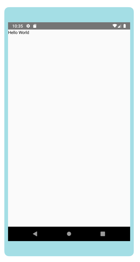
You'll notice that “Hello World” is rendered on the screen in the top left corner. Because you didn't define how you want the text to be rendered, it displays in the default location, which is the top left corner.
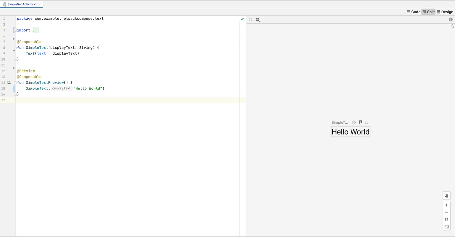
Something that you'll instantly notice is that in order to visualize what you just built, you had to run the app. There has to be a better way, right? You bet! Compose comes with a very handy way to visualize the composables right from the comforts of Android Studio. It comes with an annotation called @Preview that allows you to create “previews” for the composables that you just created. Here's how you set it up-
@Preview @Composable fun SimpleTextPreview() { SimpleText("Hello World!") }
Once you've created previews for your composables, you're able to view them right from Android Studio, as shown in Figure 2. Compose takes it a step further and allows you to also interact with your composables and see them in action without the need to use them in your app. Lastly, if you want to see them in action on a device, you can deploy a composable function to run on the emulator/device without actually using it anywhere in the app. Features like these really accelerate UI development and make you more productive.
Modifiers
You now know how to display some text on the screen. Let's try to spruce up the text by adding some background color and padding around it.
@Composable fun SimpleText(text: String) {
    BasicText(
        text = text,
        modifier = Modifier.background(Color.LightGray).padding(16.dp)
    )
}
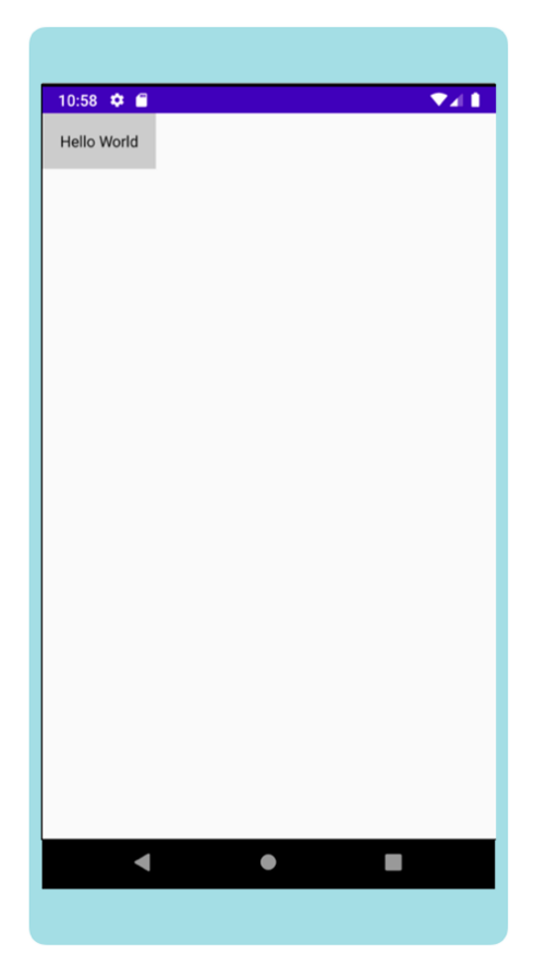
You're still using the same example that you started with but you've made a couple of tiny improvements. You'll notice that you're passing a new parameter called modifier to the BasicText composable. Modifiers are your best friend in Jetpack Compose and they're also my favorite feature. You can think of Modifiers as implementations of the decorator pattern that are used to modify the composable that it's applied onto. It adds functionality to the Composable it's applied to and the majority of the default composable functions accept a Modifier parameter.
In this example, you use the background and padding modifiers with the appropriate values to get the desired effect on your text. The other interesting thing to note is how you're able to assign dp dimensions without using XML resources or any complicated conversions. This is an extension function on the Int type. It returns a Dp class, which is a first-class citizen in Compose. This makes it really easy to have constants for these values in pure Kotlin and convert them at runtime as needed. You can see this in action in Figure 3.
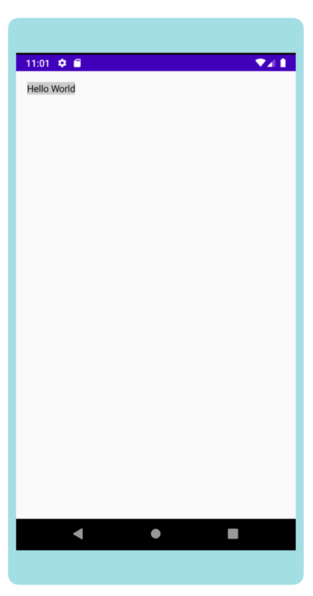
The other interesting thing about Modifiers is that its order has an impact on behavior. In the example above, you first specified the background color and then the padding. This ensures that the color is also applied to the area that has the padding. But what if you wanted to have the color only in the area encompassed by the padding? In order to do this, simply invert the two statements and get the behavior that you desire.
@Composable fun SimpleText(text: String) {
    BasicText(
        text = text,
        modifier = Modifier
        .padding(16.dp)
        .background(Color.LightGray)
    )
}
You can see the change in Figure 4.
What Does It Mean to be “Declarative?”
You're starting to just dip your feet into Compose and slowly starting to wrap your head around some basic concepts. Let's look at another example - this time, you'll try to display an alert dialog. It's an interesting example because if you were confused about what being “declarative” means, this should make it clear and hopefully give you that “aha” moment where a lot of things start to make sense.
When talking about declarative programming, it's important to also talk about imperative programming to provide a contrast. One common way these approaches are compared with one another is using the “What vs. How” analogy.
Imperative programming is about specifying the “How” when building UI. “How should I render a certain UI and what are the exact steps needed to render it?”
Let's take the example of showing an alert dialog in your app. This is what you typically do in classic Android.
val alertDialog = AlertDialog.Builder(context).setTitle("CODE Magazine!").setMessage("Isn't it amazing?")
// Somewhere else in code if (some_condition_is_met()) {alertDialog.show()}
// Somewhere else in code if (some_other_condition_is_met()) {alertDialog.dismiss()}
On the other hand, declarative programming is about specifying the “What” when building UI. “What should I render?”
Let's try to implement the same functionality using Compose.
@Composablefun AlertDialogComponent() {
    if (some_condition_is_met()) {
        AlertDialog(title = {Text("CODE Mag!")}, text = {Text(text = "Howdy!")})
    }
}
You first check to see if the condition to show an alert dialog is met. If it's met, you use the pre-defined AlertDialog composable with the appropriate metadata. Notice that you aren't doing any mutations or calling the show/dismiss methods to update the internal state of the UI. You simply specify how your UI looks “right now,” given all the conditions that this UI component needs to care about. The fact that this code path is executed causes the contents of the screen to be updated. In this case, the alert dialog is shown. If the condition isn't met, the alert dialog isn't shown. Another less-spoken-of benefit is that your program can be context-independent. This means that because your code is concerned with what the ultimate goal is, the same code can be reused in different scenarios.
State
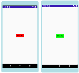
Reacting to state is core to how Jetpack Compose works. Compose provides primitives for doing state management inside a Composable function. Let's look at an example that uses some of these primitives. You're going to create a composable with a button that changes its color based on whether it has been clicked. You can see the end result you're hoping to achieve in Figure 5.
@Composable
fun ButtonClickComponent() {
    var showPopup by remember {
        mutableStateOf(false)
    }
    val color = if (showPopup) {
        Color.Green
    } else {
        Color.Red
    }
    val colors = ButtonDefaults.buttonColors(backgroundColor = color)
    Button(
        onClick = { showPopup = true },
        colors = btnColors
    ) {
        Text(text = "Click Me")
    }
}
Start off by creating a mutable variable called showPopup that's initialized using a couple of interesting keywords that you've probably never encountered before in Android development: remember and mutableStateOf. Reacting to state changes is the core behavior of Compose. Any time the value of this variable changes, all composables that use this value are intelligently redrawn and updated. It's like this composable is “subscribed” to this value. The other one, remember{}, is a helper composable that calculates the value passed to it only for the first time the composable is composed. It then returns the same value for every subsequent composition. This redraw of a composable is called Recomposition. It happens in a very efficient manner and only the composables that use this value are recomposed; the rest remain as is. There are similar concepts in other declarative UI frameworks like React and Compose is inspired from these reactive frameworks.
Layouts
Let's look at something more realistic. This time, you're going to implement a component that looks like Figure 6.
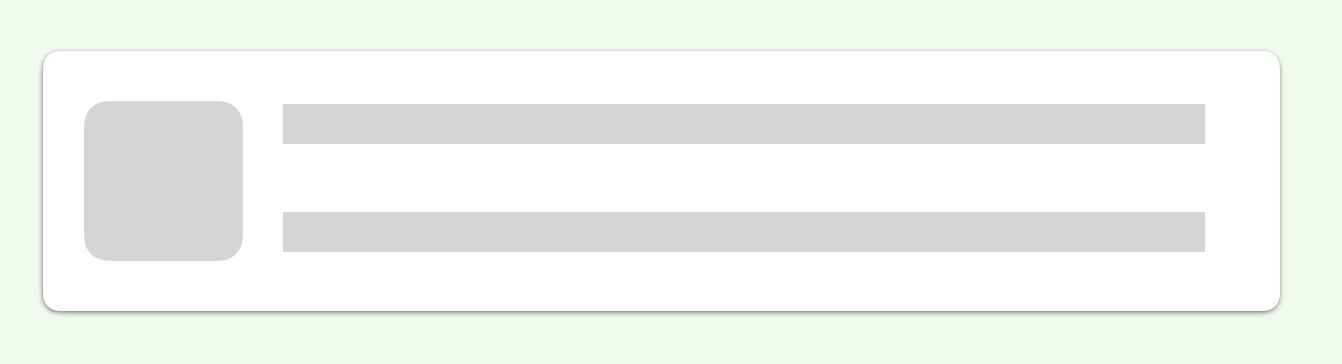
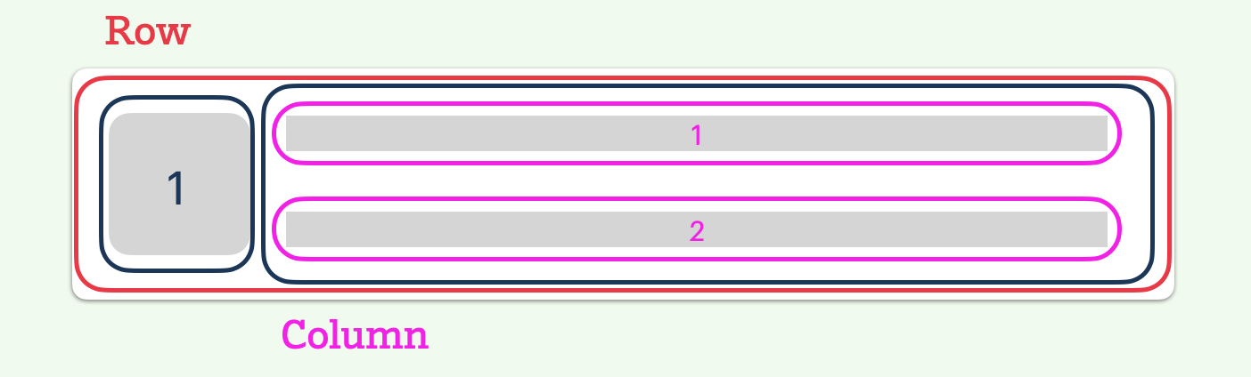
You often see components that look like this across many apps and use them on a daily basis. Before you start building this component in Compose, let's break down this component into a few core pieces, as you can see in Figure 7. The component is a row with two elements. The first element is the image view and the second element is a column containing two elements.
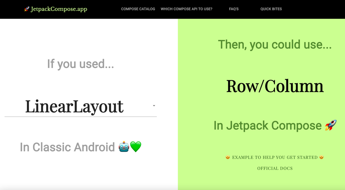
If you were to build such a component using classic Android, you'd probably make use of something like LinearLayout or RelativeLayout. This might make you wonder “What is the equivalent of LinearLayout in Jetpack Compose?” Moreover, wouldn't it be nice if there were a way to know the corresponding Compose APIs for an existing classic Android functionality? In order to solve this pain point, I built a tool that does exactly this. You can find it here: http://bit.ly/WhichComposeApiToUse. As you see in Figure 8, Jetpack Compose provides Layout primitives like Row and Column to arrange your composables. And that's exactly what you'll use for the component that you're trying to build.
@Composable
fun ImageWithTitleSubtitleComponent(
    title: String,
    subtitle: String,
    imageUrl: String
) {
    Card(
        shape = RoundedCornerShape(4.dp),
        modifier = Modifier.fillParentMaxWidth().padding(16.dp)
        ) {
            Row(
                modifier = Modifier.fillMaxWidth()
                .padding(16.dp)
            ) {
                // Assume we created a component to render an Image.            NetworkImage(imageUrl)
                    Column(
                        modifier = Modifier.padding(start = 16.dp)
                    ) {
                          BasicText(title)                BasicText(subtitle)
                    }
            }
        }
}
The code example above is fairly straightforward. You use layout composables the same way that you described what you wanted to build. And that's how software development should feel like - as simple as describing what you're trying to build. You also use the Card composable that adheres to the material design spec. Like Card, there are tens of other pre-defined composables from the Material Design spec that are already available for use!
List
Another common functionality that you probably see in every app is a list of some sort. As a reminder, just look at Figure 9 to see the amount of code that's needed to create a performant list in classic Android.
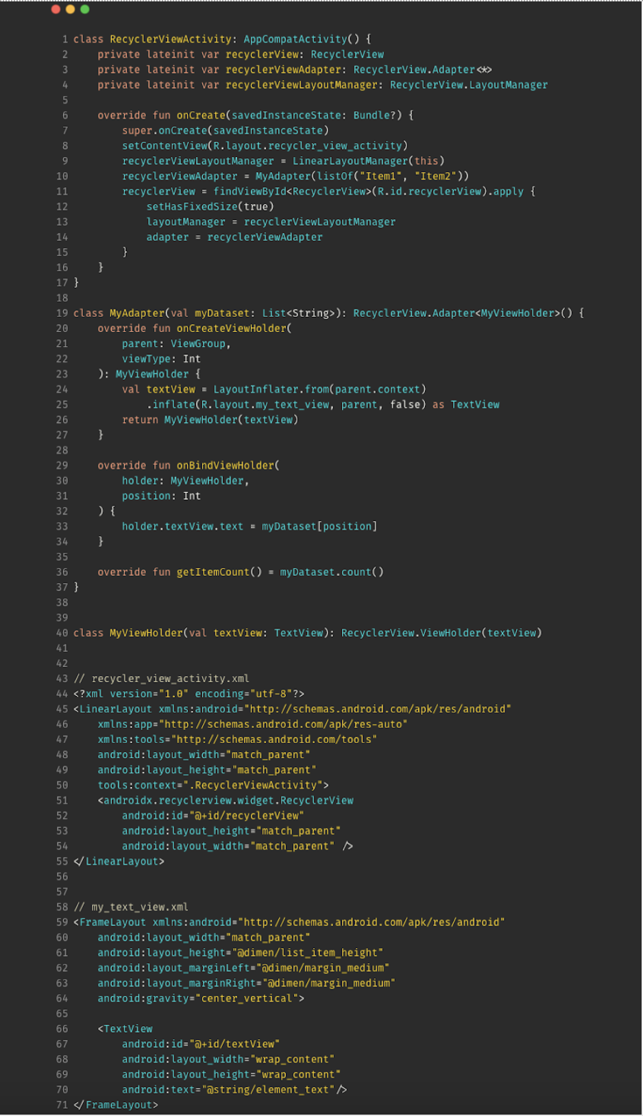
Now let's contrast it with what it takes to create a performant list in Jetpack Compose. You're going to use the same tool that you saw in the previous example to find the right API to accomplish this. The tool (http://bit.ly/WhichComposeApiForRecyclerView) tells you that LazyColumn is the RecyclerView equivalent in Jetpack Compose, so let's use that. Additionally, you're also going to use the ImageWithTitleSubtitleComponent composable that you created in one of the previous examples. Listing 1 demonstrates all the code that's needed to create a performant list that's capable of having dynamic list items.
Listing 1: Example that demonstrates creating a performant list in Compose
@Composable
fun ListComponent(list: List<ListItem>) {
    LazyColumn(modifier = Modifier.fillMaxHeight()) {
        items(
            items = list,
            itemContent = { listItem -> ImageWithTitleSubtitleComponent(
                title = listItem.title,
                subtitle = listItem.subtitle,
                imageUrl = listItem.imageUrl
            )}
        )
    }
}
Recreating similar functionality in classic Android requires tens of lines of code. When I look at Listing 1, I'm forced to think about why creating a list on Android wasn't always this simple. It took a few years to get here but I'm glad this is what the future of Android looks like.
Building Your First Complete Screen
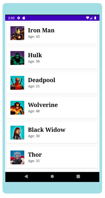
Now that you have a good understanding about the core concepts of Jetpack Compose, let's try to build a screen with a real-world use case. Let's say that you want to build a screen for an app that renders a list of some of your favorite comic superheroes.
Listing 2 starts off by creating a new Activity called SuperheroListActivity. In addition, you also initialize a ViewModel implementation called SuperheroesViewModel that will be responsible for managing the business logic in your app. Lastly, you create a custom composable called SuperheroListScreen that will be responsible for presenting the UI logic for your screen. It takes in a live data object that contains the list of superheroes that will be displayed on this screen.
Listing 2: Activity that will host the superhero list screen
class SuperheroListActivity : AppCompatActivity() {
    override fun onCreate(savedInstanceState: Bundle?) {
        super.onCreate(savedInstanceState)
        val viewModel = ViewModelProvider(this).get(SuperheroesViewModel::class.java)
        setContent {SuperheroListScreen(viewModel.superheroes)}
    }
}
Listing 3 has the implementation of the ViewModel that contains the business logic for your screen. It's responsible for loading the list of superheroes from the network. For this example, just emulate a network request by adding a delay of two seconds and set the LiveData object with the appropriate value. The SuperheroesViewModel also exposes a LiveData object that will be consumed by your UI. Next, let's look at how SuperheroListScreen is implemented.
Listing 3: ViewModel implementation that holds the business logic for your screen
class SuperheroesViewModel : ViewModel() {
    val superheroes = liveData {
        val superheroList = loadSuperheroes()
        emit(superheroList)
    }

    // Added a delay of 2 seconds to emulate a network request. This method
    // just sets the list of superheroes to the livedata after 2 seconds.
    suspend fun loadSuperheroes(): List<Superhero> {
        delay(2000)
        return listOf(
            Superhero("Iron Man", 43, "https..."),
            Superhero("Hulk", 38, "https..."),
            ...
        )
    }
}
// Model class for superhero metadata
data class Superhero(
    val name: String,
    val age: Int,
    val profileImageUrl: String
)
Anytime you're introducing a new framework, one of the most important questions that needs to be addressed is the interoperability with the existing system. Interoperability could be one of the biggest barriers to adoption and Compose does an excellent job in having a solid narrative about it. You can use Compose and classic Android interchangeably in a really seamless way. In addition, it also lets you convert some existing concepts into one that Compose understands.
For example, the code snippet below illustrates converting a LiveData object into a Jetpack Compose “state” using the observeAsState extension function on the live data object. As a reminder, you saw an example of using the Jetpack Compose state in the “State” section. Next, simply check whether the state object (which is a list) is empty or not. When it's empty, you want to show the loading screen; otherwise you'll want to show the list of superheroes.
@Composable
fun SuperheroListScreen(
    list: LiveData<List<Superhero>>) {
        val superheroes by list.observeAsState(
            initial = emptyList()
        )
        if (superheroes.isEmpty())
            {LoadingComponent()}
        else {SuperheroListComponent(superheroes)}
    }
The loading screen is rendered on the screen when the request to load the superhero list is in flight. The logic for implementing the loading screen is fairly straightforward.
@Composable
fun LoadingComponent() {
    val alignment = CenterHorizontally
    Column(
        modifier = Modifier.fillMaxSize(),
        verticalArrangement = Center,
        horizontalAlignment = alignment
    )  {
        CircularProgressIndicator(Modifier.wrapContentWidth(CenterHorizontally)
        )
    }
}
You start off by creating a new component, as this use case is fairly common and making a separate component makes it easy to reuse in other places. You use the Column layout and configure it to occupy the entire screen using the fillMaxSize modifier. In addition, you also configure the children of this column to be vertically and horizontally centered. Lastly, you use the pre-defined CircularProgressIndicator that's part of the Material Design specification for showing a loading indicator.
The very last thing your screen needs is a way to render the list of superheroes. You'll pretty much use a combination of a few examples you saw earlier, specifically in the “Layout” and “List” sections. Listing 4 brings everything together and that's all you need to replicate the screen you see in Figure 10.
Listing 4: Composable function responsible for rendering the list of superheroes
@Composable
fun SuperheroListComponent(
    superheroList: List<Superhero>
    ) {
        LazyColumn {
            items(
                items = superheroList,
                itemContent = { superhero ->
                    Card(
                        shape = RoundedCornerShape(4.dp),
                        backgroundColor = Color.White,
                        modifier = Modifier
                        .fillParentMaxWidth()
                        .padding(8.dp)
                    ) {
                        ImageWithTitleSubtitleComponent(
                            superhero.name,
                            "Age: ${superhero.age}",
                            superhero.profilePictureUrl!!
                        )
                    }
                }
            )
        }
    }
Summary
With a brand-new declarative UI toolkit, Android development is all set to get a lot more fun. Although Compose is still in its infancy, its already showing a lot of promise and the community is very excited about it. There are enough signals to point to the fact that Compose is going to be the de-facto way of building Android apps. It also lowers the barrier to entry for a lot of non-engineers with its intuitive APIs that are easy to understand.
I hope that this article gave you a glimpse of what's possible to do using Jetpack Compose. I can't wait to see how you use it to build amazing mobile experiences. Happy Composing!