


In my last installment of “Stages of Data” (https://www.codemag.com/Article/2008071/Stages-of-Data-A-Playbook-for-Analytic-Reporting-Using-COVID-19-Data), I presented a public data by county across the United States. The solution covered aspects of dashboard/analytic reporting that will be common across many applications. In this issue, I'll continue with the project. We'll look at some updated COVID-19 numbers, show some new metrics, and some new visualizations.
Stages of Data, Literally and Figuratively
I “retired” my Baker's Dozen Productivity series that ran from 2004 through 2017 and built a new series brand with “Stages of Data.” One of the goals was emphasizing the different phases of an analytic solution: identifying source data, exploring extract strategies, organizing data into different model layers, reporting on and presenting data, etc.
In addition, there's also another dimension to analytic solutions: the points in time when certain analytic perspectives take on a stronger meaning. For instance, you need a period of time to even begin thinking about trend analysis. Along with that, you need to identify blocks of time that hold significance. In the case of COVID-19 reporting, many who are following this data have eschewed (rightly so) daily analysis. Over time, even weekly analysis can be problematic. Months or even years can go by before anyone finds the temporal “sweet spot” in this kind of data, but I'm finding that taking a picture of numbers over the last two weeks and comparing to the prior two weeks gives a better picture of how a particular geography is progressing/regressing during this pandemic.
There's also a corollary to stages of data: “Know Thy Data.” I've known some very talented and sharp programmers, but unfortunately, a few of them didn't recognize the value of understanding the data. The old clich? is true: Context matters. I recall years ago working with a Web developer who built a new summary Web page that incorrectly showed sales in the billions of dollars instead of low millions. There were multiple reasons for the difference, but the bigger issue was that the developer knew the Web page was showing data in the billions and didn't realize that it was orders of magnitude off. Ideally, the developer should have realized it. Unfortunately, the business side wondered, “Don't our developers know our business and sales numbers? Didn't they realize this was way off?” They had a point.
Similarly, when you work with data, regardless of the physical stage, you need to know the context of the data and be able to spot any MAJOR outliers. I'm not saying you should be able to detect if sales went up 10% from month to month: I'm talking about face-validity issues. Two of them came up in the last two weeks regarding COVID data.
In late April and early May, New Jersey was reporting nearly 1,800 deaths per week. Then that number declined a few hundred each week, to a low of 268 the week of 6/20. Then the following week of 6/27, the death count spiked to nearly 2,100 for that week, even though case counts had been dropping consistently for two months. As it turns out, in the week of 6/27, health officials went back and reviewed medical data and determined that there were 1,800 “probable” COVID deaths going back a few months, thus the weekly spike. Obviously, if the major data sources are counting it, we need to count it: but we also need to be able to explain any spikes of that magnitude.
A similar situation occurred in New York at the end of June. After weeks of declining death counts, New York experienced a spike of about 700 deaths that occurred over several weeks and there was a delay in the reporting. This kind of situation obviously skews any trend analysis. This is a fact of life, but we need to be prepared to explain it.
The moral of the story: Know Thy Data. The final response to a wonky number should never be, “That's what the data feed said.” If the number is bizarre, go find out why. Know Thy Data.
Know Thy Data. The final response to a wonky number should never be, “That's what the data feed said.” If the number is bizarre, go find out why.
What's on the Agenda for Today:
Here are the topics for today:
- A new state profile page with ranking formulas
- New trend-based measures
- Defining custom filter groups
- A new visualization page to show death trends
- A recap of the Analytic playbook
- A look ahead to the next installment in this series
New State Profile Page with Some Rankings
In keeping with the theme of content reward, I wanted to build a summary page to show all the major COVID statistics for a state. I want this to be available either as a drill-down or even as a report tooltip. Additionally, I wanted to rank the state from high to low compared with other states for each statistic, and then come up with a composite ranking. This last part is a challenge: how can you rank states according to overall impact? Obviously, you might initially rank based on death numbers: but then again, smaller states have some very bad numbers for population density.
Figure 1 shows a Power BI report page for a state profile. I've chosen Massachusetts.
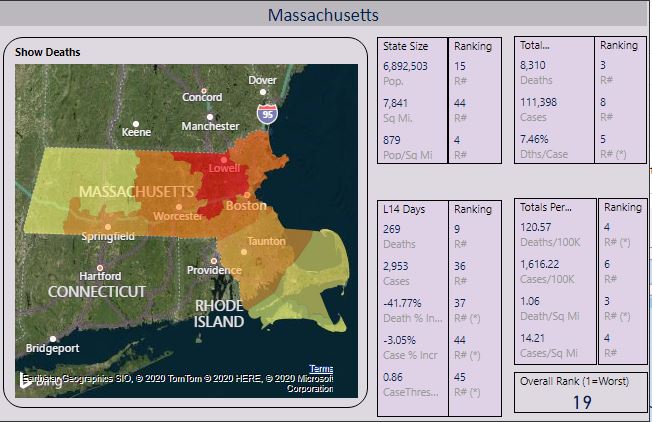
I ranked states with respect to each other, across all the metrics in Figure 1. I'm also going to show an overall composite rank based on six metrics that I'll reference below. Generally speaking, the lower the rank, the worse the situation for that metric. So the state with the highest overall cumulative deaths (New York) will be ranked #1 for total death count, and the state with the lowest overall cumulative deaths (Wyoming) will be ranked #48 for the same metric.
In Figure 1, you see in the upper right that Massachusetts has the third highest total death count (8,310 deaths), and the fourth highest death count per 100K residents (120.57). Although those two ranking numbers are nearly the same (third and fourth), they do illustrate that population and population density can factor into some of the rankings for each metric. The colored map by county is based on whatever metric I chose to display - in this case, deaths, with Middlesex county in red to show the county with the highest number of total deaths.
Now, let's take a look at the overall ranking of 19, based on the six metrics with an asterisk beside the individual rankings. For the first three metrics, the state is doing “better” than most states. For the last three, the reverse. Going from left to right:
- 37th in the country in terms of deaths in the last two weeks as a percent of two weeks prior (trending down 41.77%)
- 44th in the country in cases in the last two weeks as a percent of two weeks prior (trending down 3.05%)
- 45th in the country in terms of Case Threshold Performance Index (no more than 50 new cases last two weeks, per 100K residents)
- 5th in the country in terms of Deaths per Case, at 7.46%
- 4th in the country in terms of Deaths Per 100K residents (120.57)
- 3rd in the country in terms of Deaths per Square Mile (1.06)
If you add up all the ranking points, that sums to 138. Let's take a step back again. Ideally, a state (we'll call it State A) with no cases and no deaths would be ranked #48 in each of the 6 COVID metrics I'm using for a composite ranking, for a grand total of 288 ranking points. At the other extreme, a state (State B) that was the absolute worst in all metrics would be ranked #1 in each of the six COVID metrics, for a grand total of six ranking points.
State A would be ranked #48 out of 48 overall, as 288 ranking points is the maximum. That means, according to this metric, that State A has been “least impacted” by COVID. Conversely, state B would be #1 out of 48, as six ranking points is the lowest possible (again, lower is worse). Therefore, State B would be “most impacted.”
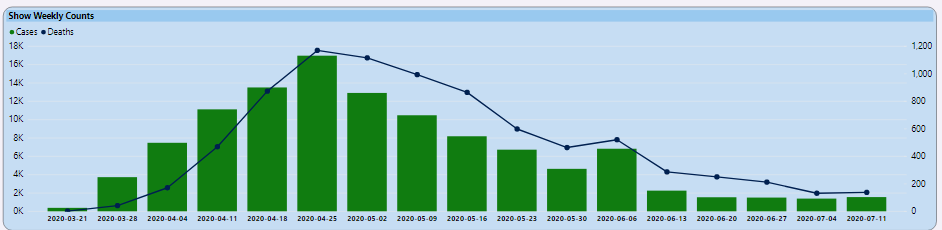
This is simply one way to assess an overall impact score for a state, relative to other states. Massachusetts is the “19th worse” in terms of overall impact. The six metrics above use a combination of current trends (where the state is doing well compared with most states) and overall numbers. The state has one of the higher death tolls in the U.S. but, as you can see from Figure 2, they have been trending better.
So how did I perform the rankings? Because I'm using Power BI for the visualizations, and ranking might be contingent on run-time filters, it's best to use the RANK functions in Power BI DAX to rank dynamically at runtime.
Let's take a look at the third metric of the six, where we don't want more than 50 new cases per 100K residents in the last two weeks. This metric was used in Pennsylvania as a guide for re-opening counties, and I've read that other states have followed suit (with some variations on the base threshold of 50). Remember that I stored population at the county level in the table StateMasterPopulationStage, so you first need to establish the population for the state, and come up with the goal/threshold:
CasesLast14DaysPer100KPopulationGoal = (sum(statemasterpopulationstage[population]) / 100000) * 50
As Massachusetts has 6,892,503 residents, that means a goal would be no more than 3,446 new cases in the last two weeks. Their case count in the last two weeks was 2,953, which means an overall index of .86. (As a general statement, an index of 1 or lower is considered “in the right direction”).
The calculation of the .86 for the Index is based on this DAX formula:
CaseThresholdIndex = sum(Covid19Last14Days[caseslast14Days]) / [CasesLast14DaysPer100KPopulationGoal]
That score of .86 for the metric (cases over the last two weeks versus a goal of no more than 50 new cases per 100K residents) is one of the better ones in the country; on this specific metric, they are ranked #45 (again, lower rankings are a reflection of negative metrics). Here is the Power BI DAX formulate for determining how that Index ranks across all states:
StateCaseThresholdPerformanceRank = rankx(all('statemasterpopulationstage'[statename]), calculate( [CaseThresholdIndex]))
Overall, I wanted to come up with a composite ranking that covered the total impact of this pandemic along with recent trends. I'm sure you can get five analysts together and come up with at least five different ways to define composite rankings and overall performance. This is just a starting point.
You can get five analysts together and come up with at least five different ways to define composite rankings and overall performance.
Obviously, I'm not going to show a dozen different states here, but let's look at the profile stage for one more state, my home state of Pennsylvania (Figure 3).
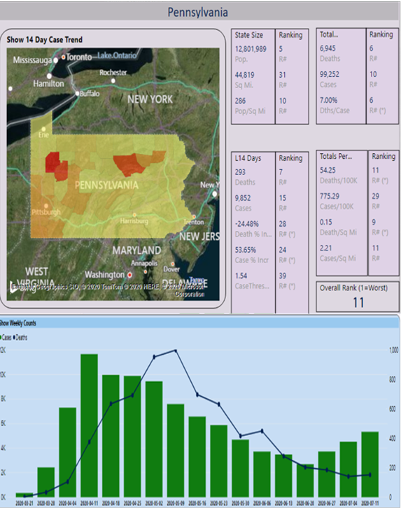
From Figure 3, the overall composite ranking for PA is 11. The death rate per case is very high, at 7%. Much of that is attributed to the high number of cases and deaths in nursing homes in the state. The Death Rate per capita in PA is very high, again due to PA being #6 overall in deaths. The state situation had been improving significantly from mid-May to late-June, although one metric of concern is the weekly rise in cases for each of the last four weeks.
One interesting way to sanity-check this performance index is the “blind comparison test.” Put the statistics for two states side-by-side, along with the rankings, but don't disclose the state names themselves. The results might surprise you, or it might help to uncover a flaw in the ranking logic.
Some New Trend-Based Measures
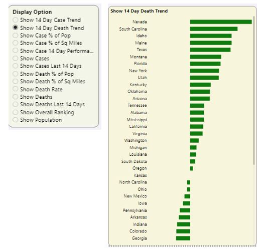
Note that back in Figure 1, one of the six metrics I used to create a composite ranking is a new one: 14-day death trend. Basically, if a state had 100 deaths in the last 14 days, and 80 deaths in the 14 days prior to that, that would be a 25% increase in deaths.
Figure 4 revisits an interface I wrote about in Part 1 of this article series: Showing states from high to low based on a chosen metric.
Here is the DAX formula that determines the dynamic measure, based on the user selection.
DynamicMeasure = switch(values(ShowMeasure[OptionName]), "Show Cases", sum(CovidHistory[Cases]), "Show Deaths", sum(CovidHistory[deaths]), etc.)
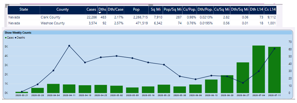
From Figure 4, you can see that Nevada has the highest death rate increase. When you look at the counties on the right side of the dashboard page and sort on deaths in the last two weeks, you can see a huge death spike compared to two weeks prior (Figure 5).
The DAX formula for this is a bit tricky, as you need to take into account either division by zero, or instances where the numerator is zero.
WeeklyDeathIncrease = if(sum(covidweeklycounts[DthsL2Wks]) > 0 &&
    sum(covidweeklycounts[Dths2WPriL2Wks]) <= 0, 1,
    if( sum(covidweeklycounts[DthsL2Wks]) <= 0 &&
        sum(covidweeklycounts[Dths2WPriL2Wks]) <= 0, 0,
        (sum(covidweeklycounts[DthsL2Wks]) ?
        sum(covidweeklycounts[Dths2WPriL2Wks])) /
        sum(covidweeklycounts[Dths2WPriL2Wks])))
In this situation, Nevada is at the lower end of the country in state population, although that doesn't diminish the significance of the increase. You could certainly adjust that metric from “deaths in the last two weeks” to “deaths per capita in the last two weeks”.
Before we move on, one other note: Back in Figure 4, you saw Florida and Texas near the top of the list, consistent with the news stories in the last few weeks about the huge spikes in those states. There's another state that currently has very concerning numbers: South Carolina. In Figure 6, I've selected South Carolina to view the top counties.
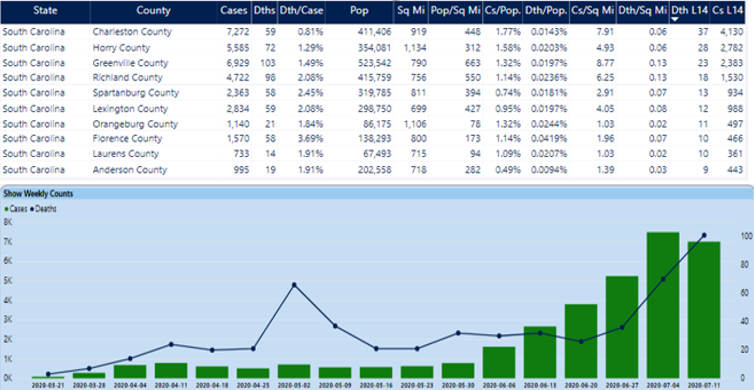
South Carolina currently ranks #9 in my overall composite ranking, driven mainly by their alarming rise in case and death numbers the last few weeks. If we were to change the two-week trend metric to a four-week trend, South Carolina's overall ranking would be even higher (worse) than #9.
The Overall Page, with Ability to Create Custom Groups
Over time, I've found myself often having to refilter on specific conditions, such as the set of counties around NYC and Northern New Jersey, or the top five states based on current cases. In my life, I've tended to do the same mundane task far too many times before I stopped and thought of a more efficient way. After about the umpteenth time of selecting nine counties or five states again and again and again, I decided to build some groupings.
After about the umpteenth time of selecting nine counties or five states again and again and again, I decided to build some groupings.
Although I don't have an interface to allow users to create their own groupings (not yet, anyway!), I do have an ability to define some conditions in the database (some of which will get executed during the most recent data load).
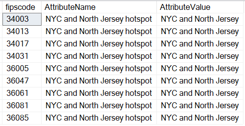
Figure 7 shows the overall summary page for the nine counties in the NYC/Northern NJ area that represent the huge hotspot of deaths.
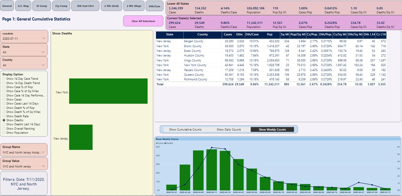
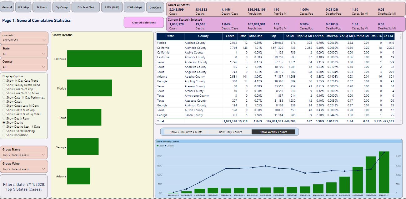
Figure 8 is the overall summary page for the top five states.
Okay, so how did I create these custom groupings? First, you create a new table called CustomGeography. You can populate it with county FIPS code values.
select * from CustomGeography where AttributeName = 'NYC and North Jersey hotspot' and AttributeValue = 'NYC and North Jersey'
In the case of the nine counties in the NYC/NJ area, I populated them manually, as shown in Figure 9.
Of course, I might also want to filter on "all others, so I need to pull all the FIPS Code values for the ones that don't meet that criteria, and insert them into the CustomGeography table with an Attribute Value of “Not NYC and Northern Jersey.”
select fipscode  from statemasterpopulationstage
where fipscode not in (select fipscode from CustomGeography
    where AttributeName =  'NYC and North Jersey hotspot' and AttributeValue = 'NYC and North Jersey' and FIPSCode is not null)
This first group filter definition is a “static” set of values. If you want to set a predefined lookup group/filter based on the top five cases, you can define one called “Top Five States,” and populate the county codes for those five states with a SQL query:
select fipscode from statemasterpopulationstage
join (
    select top 5 stm.statename, sum(cases) as TotCases
        from covid19DailyCounts cdc
        join statemasterpopulationstage stm on cdc.fipscode = stm.FIPSCode
            where casedate between dateadd(d,-14, (select max(casedate) from datelist))
                and (select max(casedate) from datelist)
group by stm.statename
order by TotCases desc ) t
on statemasterpopulationstage.statename = t.statename
A New Visualization to Show States with Growing Death Rates
You can take your metric for deaths the last two weeks as a percentage of deaths the prior two weeks and show it in a visual. In Figure 10, I'm showing the states colored by the death trend for the last two weeks: States in red have the highest trends, light yellow and light green have either slightly above or below zero trends respectively, and green states have trends well below zero.
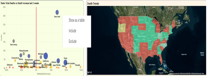
Here's one thing you can see with the scatter chart in Figure 10: New York and New Jersey are wide apart from the 0 X-Axis line. As I said in the beginning of this article, New York had a delayed death count dump in the last two weeks, resulting in a very high increase. New Jersey had a delayed death count dump three weeks ago, meaning the trend is artificially low for the current two weeks.
You might want to exclude them for the purposes of analyzing the other states. Power BI runtime allows you to right-click on a plotted point (as I've done in Figure 10) and exclude the states, one at a time.
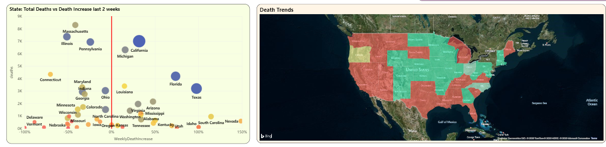
In Figure 11, you can see an updated scatter chart that shows the overall death count on the Y axis and the death trend for the last two weeks on the X axis. Now that New York and Jersey are excluded, the scatter chart rescales.
California, Florida, and Texas are three states with the highest death counts that also have a high death trend over the last two weeks. (You can also see South Carolina and Nevada all the way out to the far right on the Death Trend Y axis, although their populations are lower).
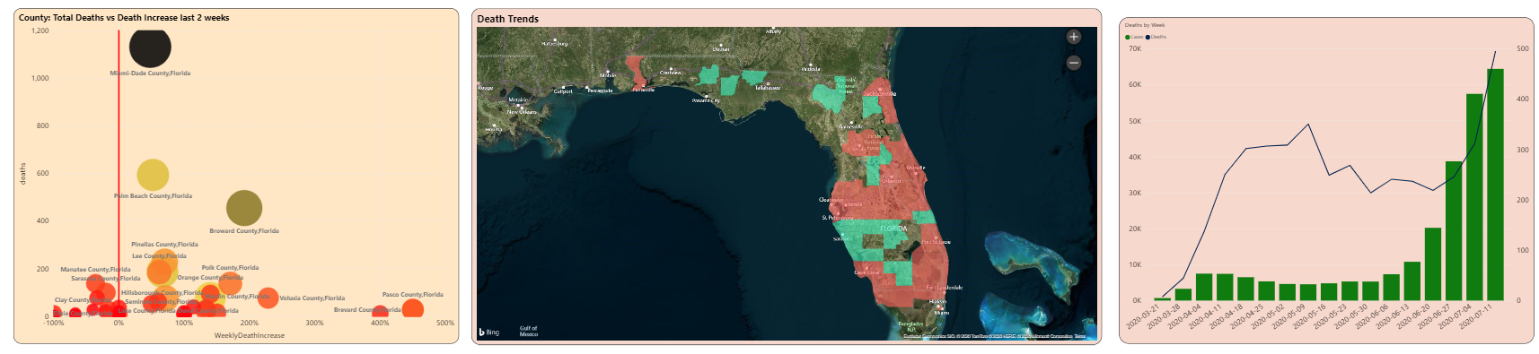
You can click on one of the states (either a plotted point in the scatter chart or the state in the map) to see the county breakdown at the bottom of the page. I'll click Florida, which gives me the county breakdown in Figure 12. Here you can see that Miami Dade County's deaths have gone up 48% in the last two weeks, and Broward county's deaths have nearly doubled (an increase of 192%)
The Playbook, Revisited
In Part 1 of this article series, I talked about common themes in analytic applications, such as shared filters, content reward, dynamic measures, trend-based metrics that truly reflect changes in reality, and combining metrics together to form a picture. I also talked about validation: in this case, whether it's looking at any huge changes in numbers, or verifying against other news sources. You can do some of that with automated scripts/procedures, but some requires good old-fashioned eyeballing and reading.
There are also pages from the playbook that fall under the “process” area. I've been developing this project on my own time, outside of my normal work schedule. (Does anyone in IT actually have a normal work schedule?) I've had some GoToMeeting sessions with some friends and colleagues, and either I'll demo what I've done, or I'll give them the link and let them navigate while I watch. Just a 15-minute session can raise ideas or opportunities for improvement. To be sure, this can backfire if you do it too often, but that regular feedback loop can be very helpful in maintaining continuous improvement.
Final Thoughts:
My primary website (www.stagesofdata.net) has an entire section devoted to this COVID-19 reporting project. This is my documentation center for the project.
The public URL for the dashboard is https://bit.ly/2A6lk3a. The link is also available on my primary website. I update the site weekly on Sunday evenings, after pulling down the data from Saturday and viewing the contents. I also post notes on any new weekly findings.
Finally, my primary website also contains some links to videos I've posted on YouTube that cover some of the main features of this dashboard.
In the Next Regular CODE Article
When I set out to write on this topic, I wasn't sure if I'd stretch it out over one or two issues. Well, I can say for a certainty that there will be a third, and here are the topics:
- A complete walkthrough of the ETL steps. I had planned to cover the ETL, but the truth is that I wound up changing my underlying data model in the last month, to more effectively handle some of the trending. So my ugly little secret right now is that although the dashboard application reflects the data, some of the underlying ETL is nothing I'd want to present. I'll be cleaning that up and that will be the primary focus of the next article.
- I'm in the process of moving my back-end database to Azure and will talk about some of the steps involved.
Stay Safe and Play It Smart
As a big fan of the musical rock group “Rush,” I'm reminded of some lyrics from a 1991 track called “Neurotica” that goes like this: “Fortune is random, fate shoots from the hip, I know you get crazy, try not to lose your grip.” We need to be mindful of our actions every day. We need to absolutely respect this virus, because this virus has absolutely no respect whatsoever for us. This isn't just a virus that causes pneumonia (which itself has led to pandemics): even healthy people have suffered severe vascular damage. Still, we need to keep our grip on this cold reality. The vast majority of people in the world know this, but still, EVERYONE needs be safe and play it smart, at all times.
Related Articles
Stages of Data: A Playbook for Analytic Reporting Using COVID-19 Data